
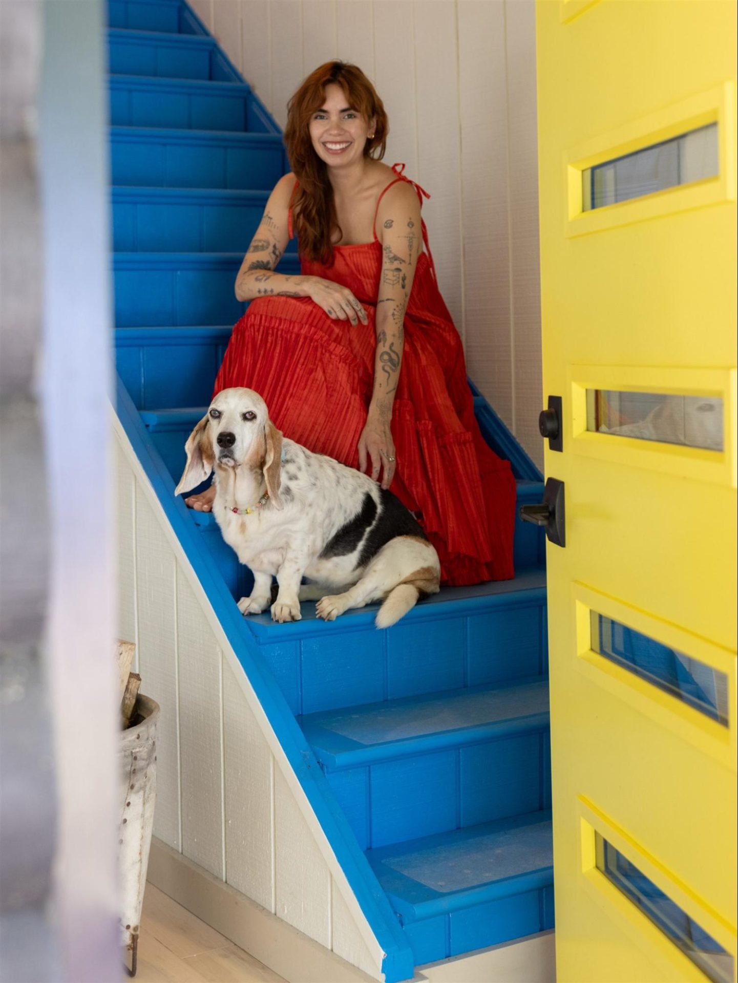
Daniela Araya is my favorite color expert and writer. She writes about color, interiors, and design culture on her Substack, “Statement Wall,” which has been recognized on the Rising in Design list, and her articles have been featured in Domino, Wallpaper*, and Homes & Gardens.
With a degree in magazine journalism, she moved to New York to work at Hearst, on titles including ELLE Decor and House Beautiful. She is also Community & Content Director at Spoak, the online interior design studio.
Daniela is now a color consultant and interior designer based in Hudson Valley, New York, and is the founder of Daniela Araya Color + Design, a studio working across residential interiors, hospitality spaces, and creative studios nationwide.
Color is the literal starting point of her practice; storytelling is the method. She frames design as emotional before aesthetic, a belief I share.
DomaChroma: What is your favorite color, and why?
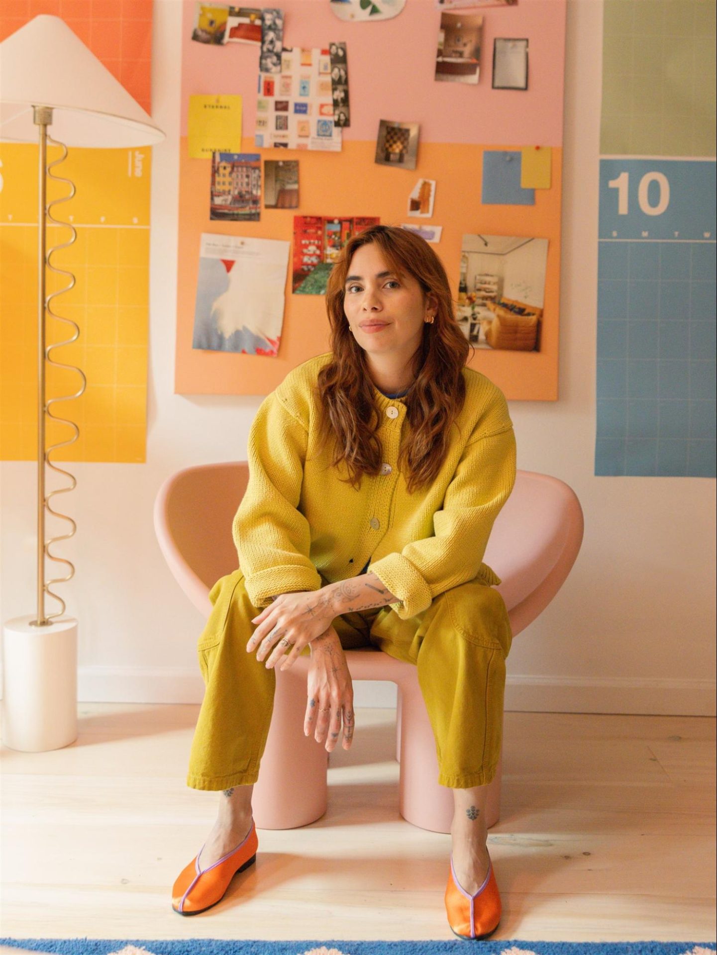
Daniela Araya: I love all colors, but I favor warm colors like yellow, orange, and red the most. They’re high-energy, like a little zap to your soul when you see them! Yellow tends to be my go-to because it’s both high-energy and joyful. I love the way it makes me feel.
DC: Your design starts with asking clients, “What makes you light up?” How did you arrive at a feeling-first approach to color?
DA: Color is something we can feel. There are studies on the psychological connection between color and behavior, but we also have to consider our own preferences and associations. Color psychology tells us one thing, but that doesn’t mean every person agrees. We all have our own relationship to color. When I started working with clients, it became clear it wasn’t as simple as “this person wants a calm room, so we’re painting it blue.” It’s nuanced. Choosing colors for a home is an emotional process for my clients. There’s a lot of weight on “getting it right” or “will I get tired of this?” I’ve found that starting with a simple question like “what brings you joy?” gets my clients excited and out of their own heads.
DC: How does your magazine editor’s eye change the way you build a color story for a room?
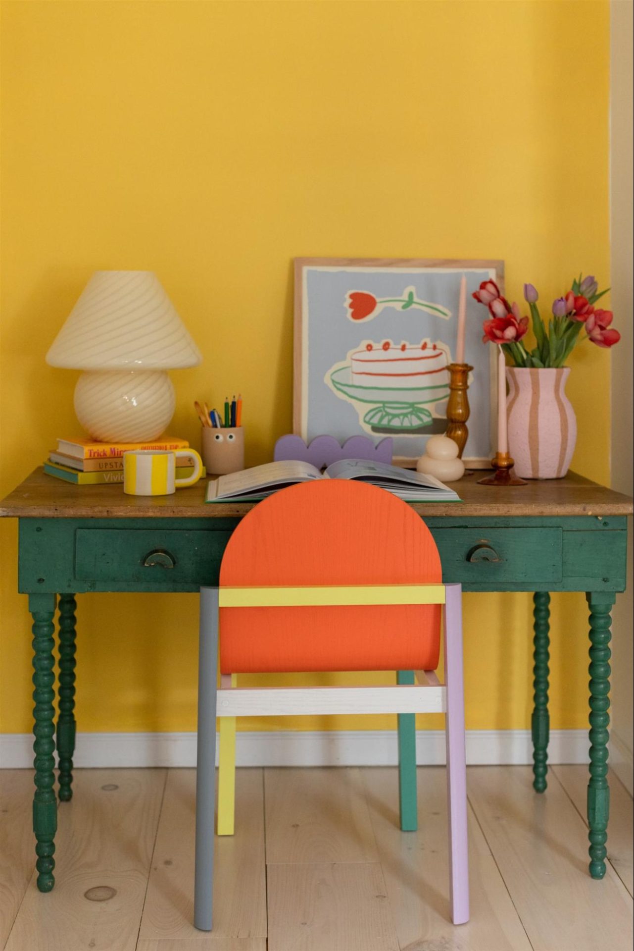
DA: I think about designing a home, and choosing colors for it, as a form of storytelling. What’s the story you’re trying to tell in the space? Who lives here? Sometimes we’re designing in an aspirational way, toward the person they want to become. Like any good story, there are layers. Color never lives in a silo. It’s about how it interacts with the objects around it, and that color will shift depending on what’s near it. It’s best to think of the color story as a whole rather than in pieces.
DC: Where do you find color inspiration, or does it find you?
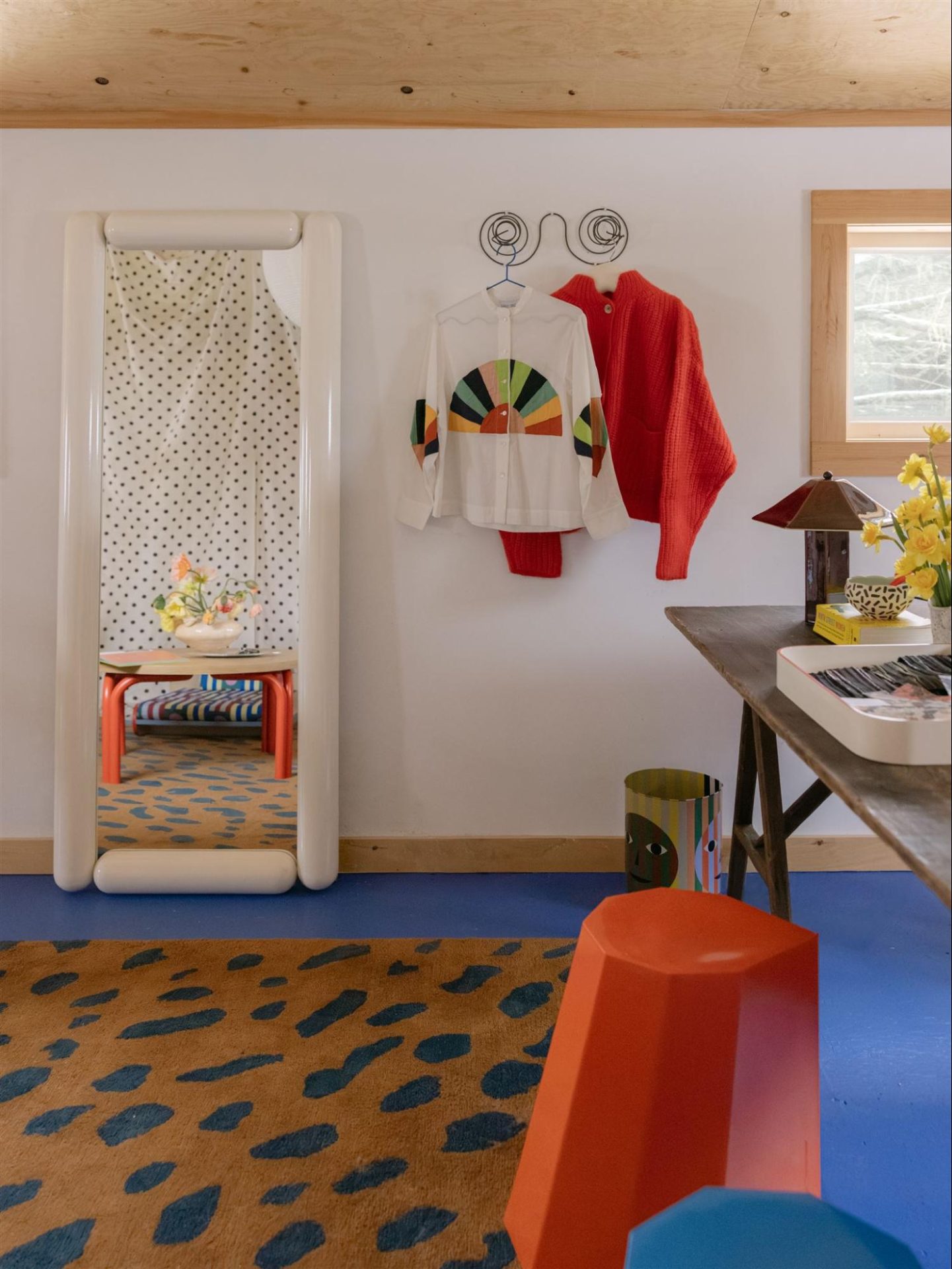
DA: Everywhere! I love color walks, where I go out seeking one specific color. Purple used to be a color I struggled with, but it’s one I’d look for on my walks, and I’ve grown to love it since. Nature has a lot to teach us. When I lived in NYC, you’d find me at the botanical gardens every week hunting for color. Now I’m upstate, so I have a lot more to work with. I also love bookstores and libraries. I’ll forever be a sucker for magazines, and I haven’t broken up with Pinterest yet, but the best inspiration usually happens outside my screen.
DC: So much of your work is making color feel accessible instead of overwhelming. How do you guide readers who are chromophobic?
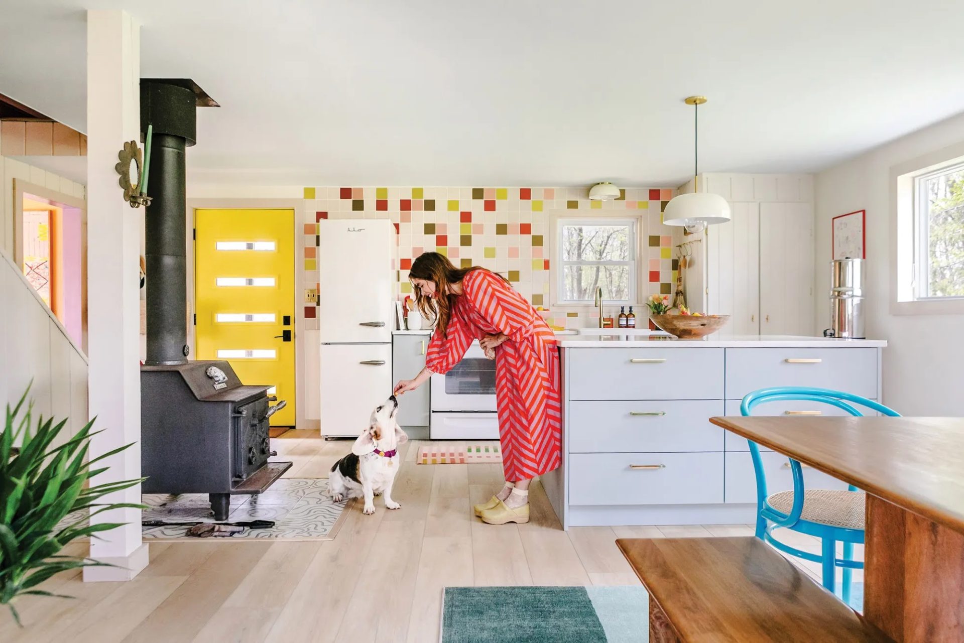
DA: I’ve been told working with me is like working with a color therapist, a name I’ve come to fancy. I love when a client lets me get into the why behind how they feel about specific colors. Sometimes it’s tied to a past experience their memory attaches to that color, and other times it’s simply fear of making the wrong decision. There’s a lot of fear around getting it wrong, around being judged by friends (or worse, Instagram), around getting sick of a color. There will always be what-ifs, but the thing is… you might get sick of a color eventually. That’s exactly how you learn what you like. I try to reframe those moments as data points for your color scientist pocket. What’s the worst that happens? You get over a color and try again later. That’s life.
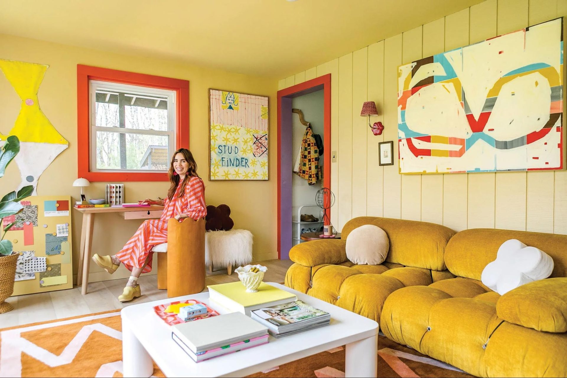
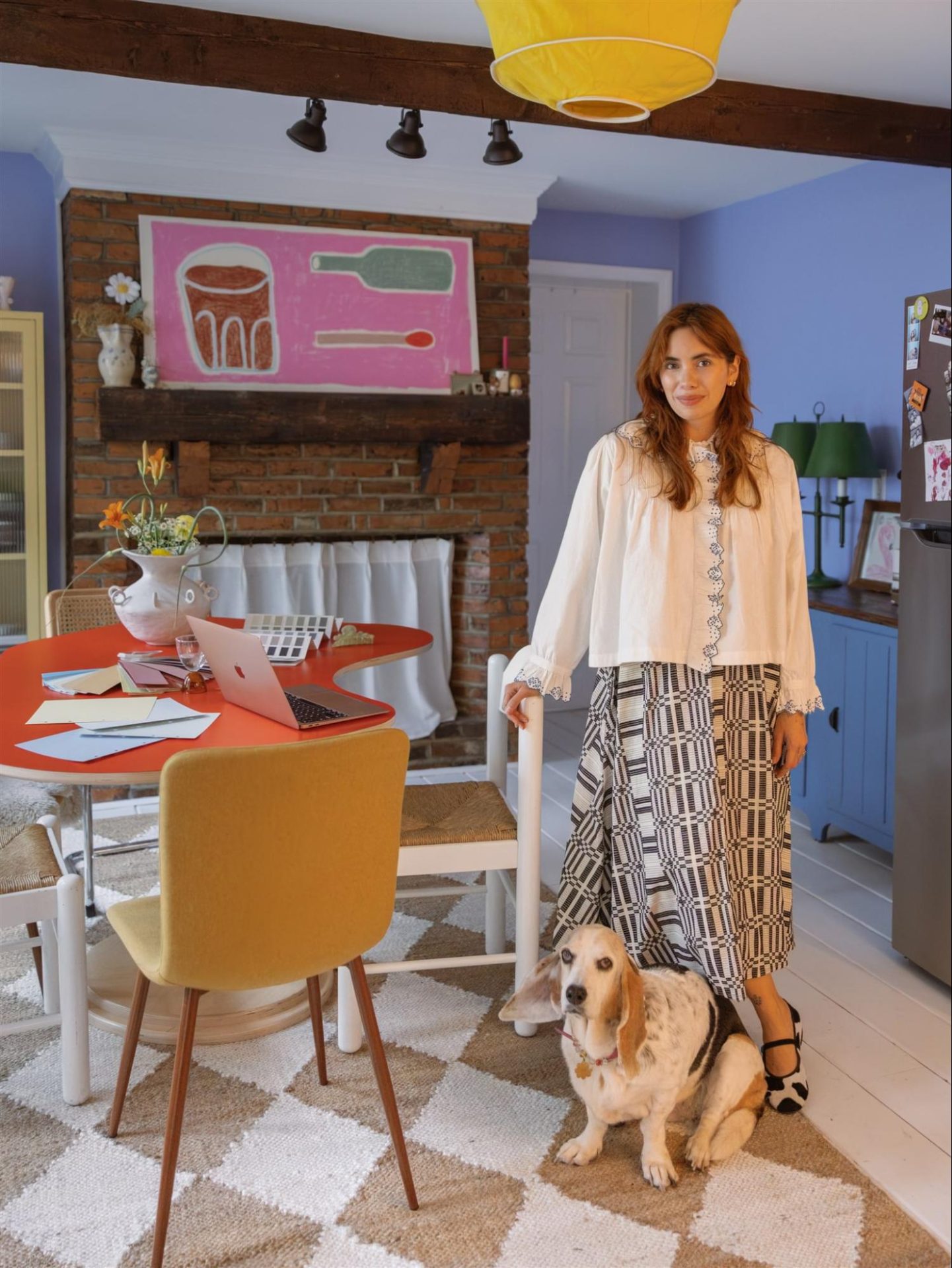
DC: Your polychromatic Delaware County cabin was just featured in Chronogram! Congratulations! You’ve turned your own home into a color experiment. What has this taught you that you’ll carry into new projects?
DA: Thank you! The biggest takeaway from designing my cabin is letting go of perfection and the fear of getting things wrong. There’s also so much beauty in slowing down. When I started the project, I wanted everything done quickly and perfectly. It’s now in its sixth year, and I’ve realized it’s always going to keep evolving. That’s the beauty of working on your own space: you can tinker and take all the time you need.
Client work is different (there are timelines and other contractors involved), but I still try to instill that same letting go of perfection. We’re not designing for Instagram. Homes are meant to be lived in, messy, and colorful in ways that only make sense to you. It doesn’t matter what anyone else thinks, as long as you love living there.
DC: What’s your message to anyone standing in a room, too nervous to think about color?
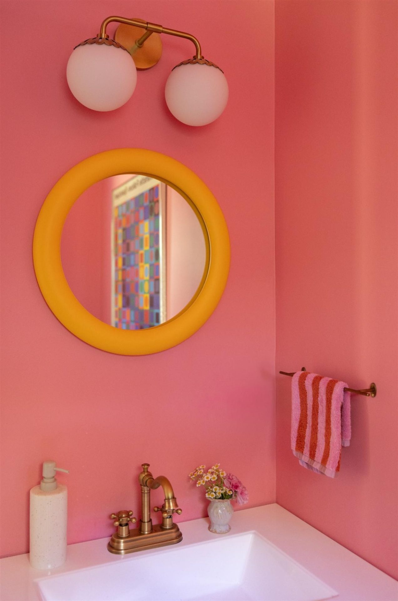
DA: If you’ve been thinking about color at all, even in the form of being afraid of it, you probably want to try it. Whether you’re choosing color for your home or a bold piece to wear, notice how it makes you feel. Give yourself time to figure out if you’re excited by the discomfort a color brings, or ready to jump in. The reward always outweighs the risk, I promise!
Site: danielaaraya.com
Substack: danielaaraya.substack.com
Instagram: @danielacaraya