
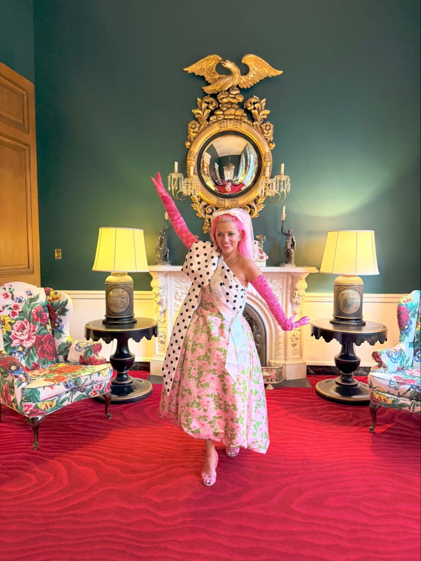
Vogue Magazine crowned Nicole Reber “Los Angeles’s most colorful real estate agent.” Her hair has been hot pink, baby blue, neon yellow, firetruck red, and highlighter lilac, all colored by her husband, world-renowned hair colorist Daniel Moon. She champions design-forward and architecturally significant Los Angeles homes, and has watched a confident color story push a sale price higher. Follow her on Instagram @nicolereber, and see her listings at nicolereberestates.com!
DomaChroma: What is your favorite color, and why?
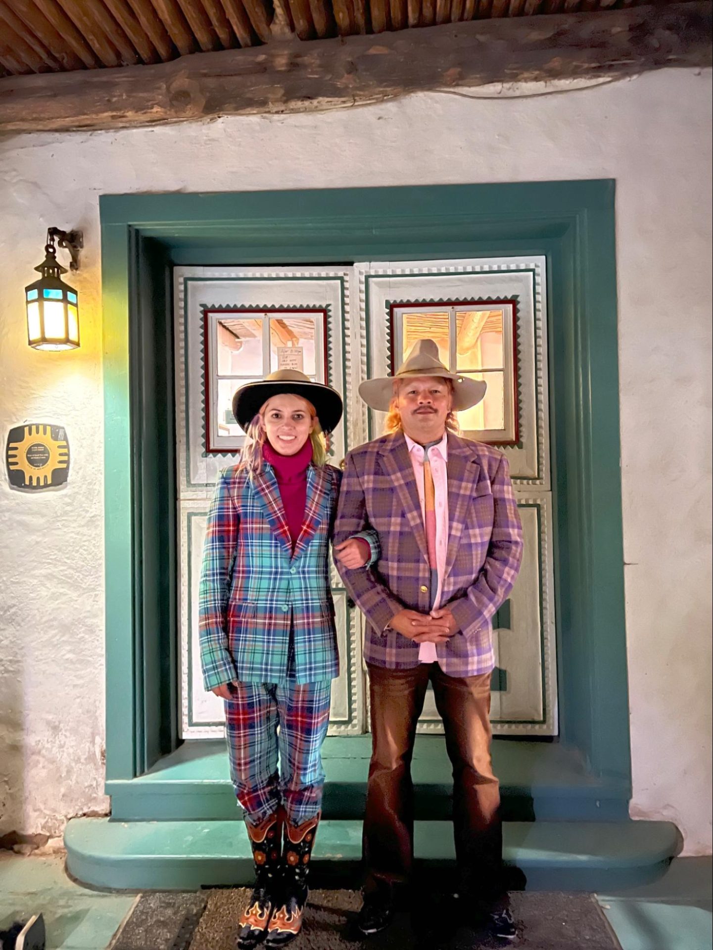
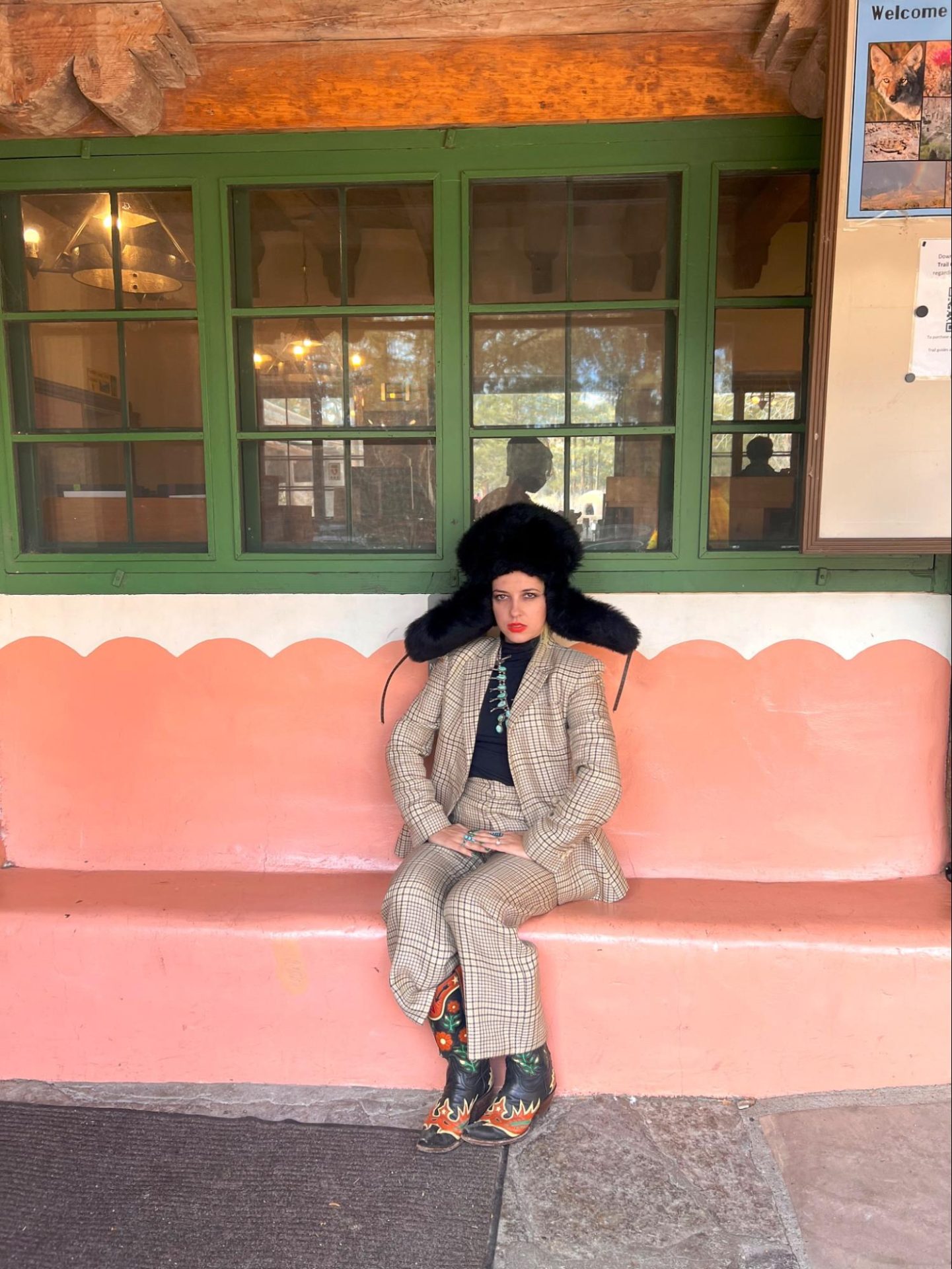
Nicole Reber: I love the turquoise blues that you see in New Mexico. There’s a special way that the doors and window frames bounce that color against the adobe clay colors that is one of my favorite color combos in the world. They’re also all for painted accents from anywhere to painted carpet runners on stairs to murals above the adobe fireplaces that I love.
Whimsical folk art is a real obsession of mine. I’m also a nerd for maximalist rococo environments.
It’s hard to find, but when you get a bright yellow-drenched room in the right shade, it can be amazing. Sanssouci Palace in Berlin has this super color-soaked yellow room with these parrots carved into the wall that comes to mind. It creates a 3D trompe l’oeil effect that is one of my all-time favorites.
Chartreuse, and different takes on bright moss colors, have been more popular in real estate recently and I love it as an all over aesthetic tone. The Charvet boutique at Bergdorf Goodman Men’s Store in NYC has a perfect example of that color in the carpet that is my favorite version of that style.
DC: Vogue crowned you “Los Angeles’s most colorful real estate agent.” How did living in full color become your signature?
NR: I’ve always loved color but I think it really started to become my aesthetic signature when I started really coloring my hair when I first started dating my now-husband Daniel Moon 9 years ago. Danny is a world-renowned hair colorist who specializes in unique colors and creating signature looks for some of the most epic people in the world.
He’s a chemist that you could show any color swatch to, and he could turn your hair that color. I had never played around with that part of my visual identity, and when I did, I quickly realized the power that it had over the way the world sees me. I’ve been pretty much every color since: baby blue into light green, neon yellow into pink, rainbow for a year, turquoise, vibrant coral, firetruck red, highlighter lilac.
Being so inherently colorful made the world open up to me in such a unique way. People instantly had an icebreaker to talk to me about my hair and that would lead to such positive interactions that I never stopped doing it. Not only is it so fun, but I think being colorful like that, for some reason, makes the world stop and chat and I loved the people I met because of it.
DC: Walk us through the most color-drenched home you’ve ever shown or sold. What made it unforgettable?
NR: I helped my friend Anastasia Graff acquire Igor Stravinsky’s old house in Hollywood. She worked with Frances Merrill of Reath Design to do one of the boldest colorful homes I have ever seen in my life. She is a FEARLESS fan of color.
One of the most amazing color stories I have ever seen in my life is her kitchen. She has lilac cabinets with a BURGUNDY La Cornue stove and checkerboard floors with a stainless steel backsplash. NO one would have ever done that combo. They would have done black or white to match the floors, but not her, she has guts and added another color element with such confidence.
Her house is a masterclass in pattern, tone, and color. Anastasia is so fearless and one of the most amazing fashion and style inspirations in my life. She can dig for the most amazing references and is a true aesthetic visionary who I’m lucky to call a friend and have learned so much from.
DC: What’s the most fascinating color story you’ve ever uncovered?
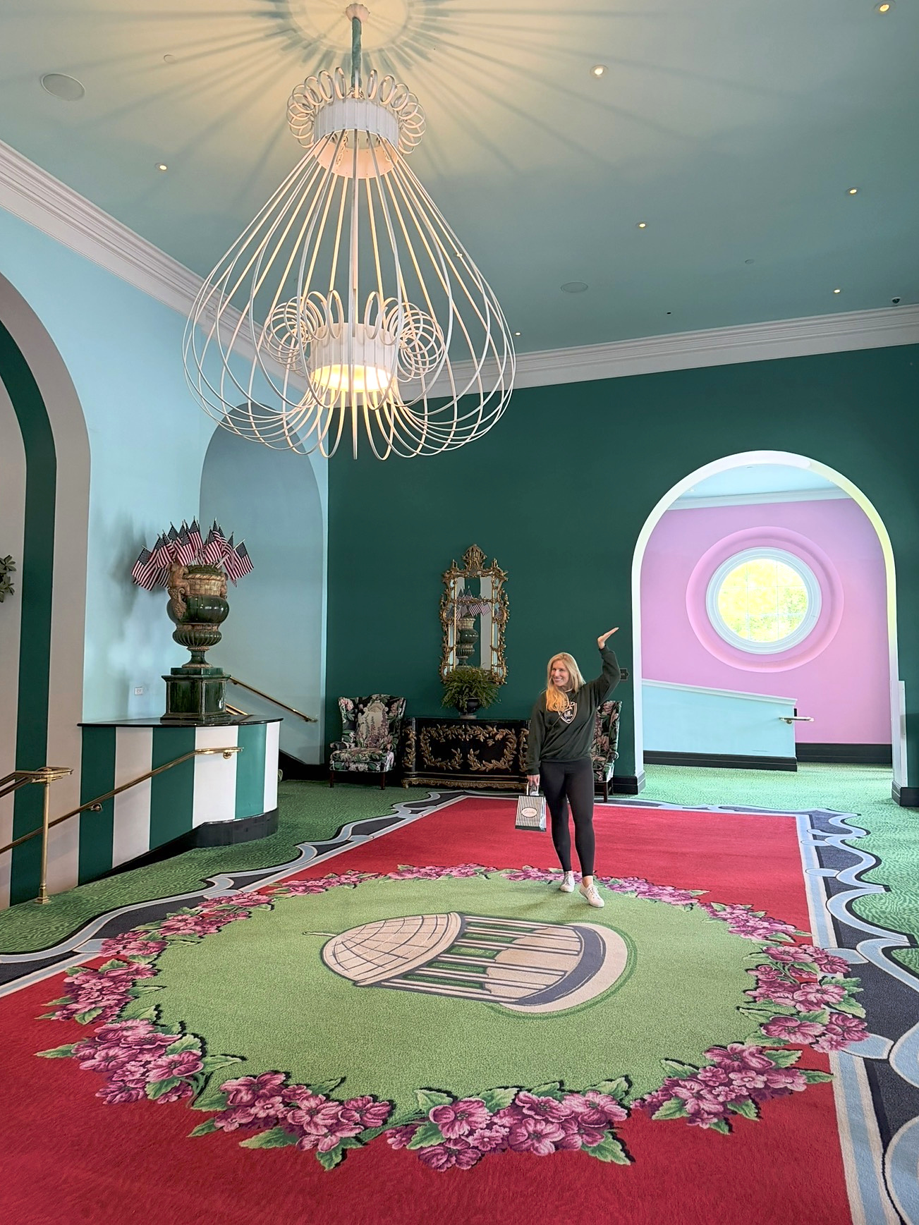
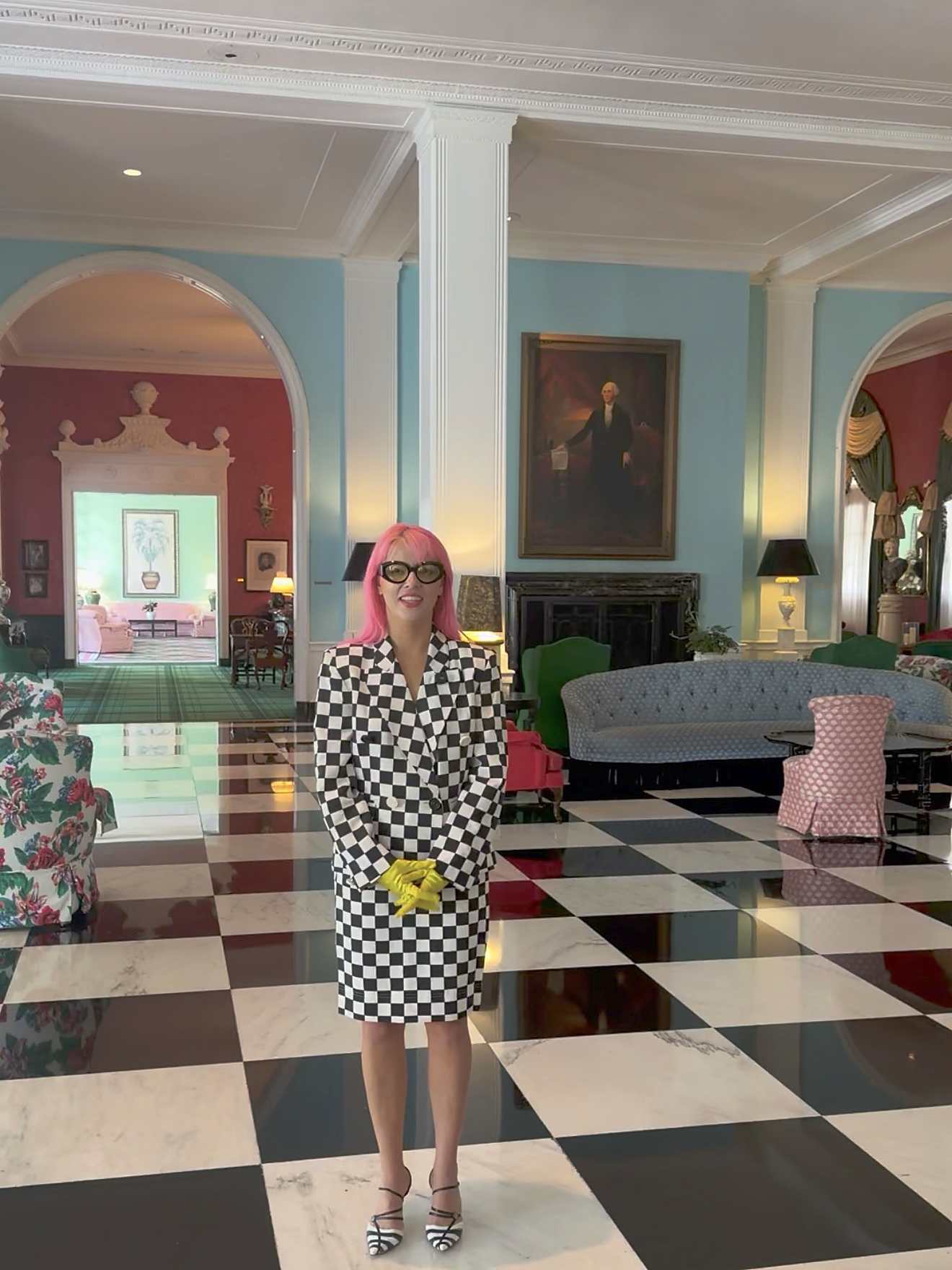
NR: I think every person should visit the Greenbrier one time in their life to understand color at the largest scale possible. After WWII, Dorothy Draper took over this massive hotel (over 1 million SF today) in West Virginia and “Draperized” it. What remains now is one of the most incredible examples of pattern, wallpaper, color, height, and scale in the entire world.
If you have never seen baby blue wallpaper stripes that go over 40 ft tall or valances that are over 100ft wide with a full color story, then you will never truly know the power of color. Dorothy Draper’s work CHANGED MY LIFE, and the design of this hotel is UNESCO World Heritage level important in its boldness and influence on countless designers in the world.
Also, it has the most incredible activities you could ever imagine: go do the clay pigeon course, a history tour, the historic sulphur baths at the spa, and you have the perfect weekend, in my opinion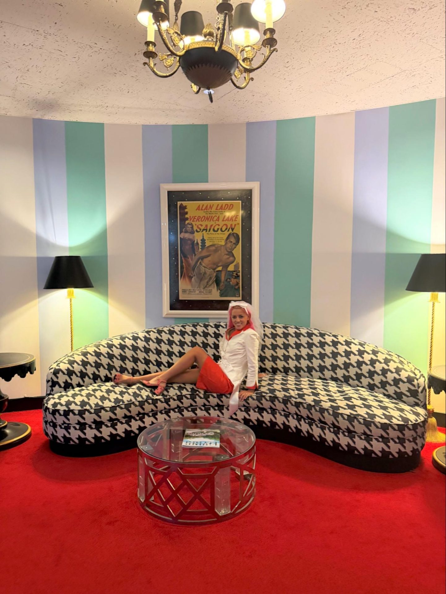
DC: Please tell us about an exciting color moment in a project you’re working on right now.
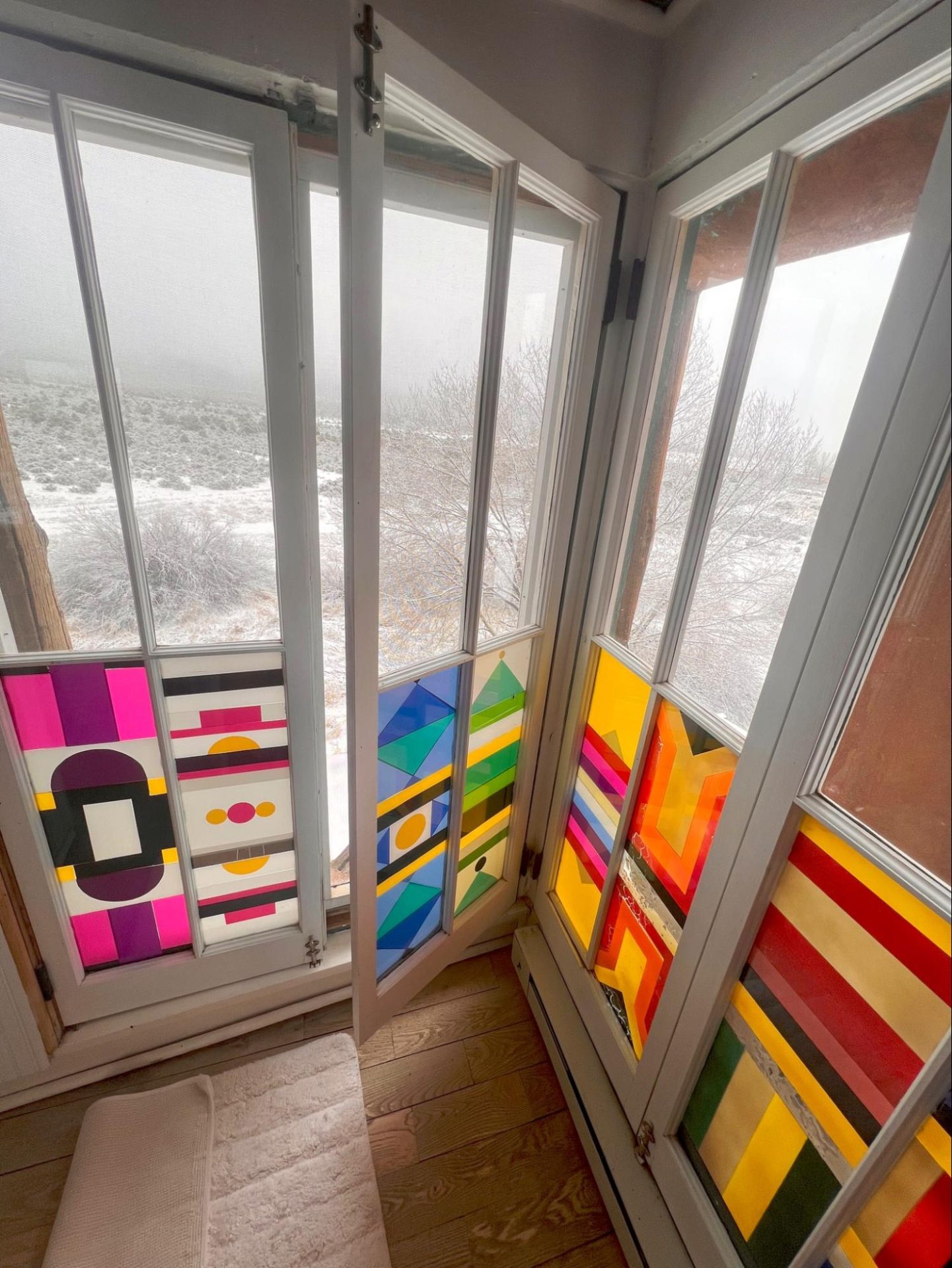
NR: I’m helping clients purchase a house right now with an adorable 1920s royal blue kitchen with copper ceilings that is so special. There are all these custom color built-ins with that Spanish flair that is so adorable. One of my favorite things about this house is that it has pops of stained glass everywhere. It’s in the bathrooms, the windows . . . it’s such a personality moment throughout the property. There’s even a secret speakeasy!
DC: What’s your message to a homeowner or builder who’s afraid of color?
NR: Color is a way to show that things are CUSTOM. When you do a home in all beige, it can be hard to convey the thought and finances put into the work. When someone chooses a color and commits to it, it clearly conveys the decision making involved and the cost to the consumer. I also think that point of view that using color brings to a home helps make it feel unique and irreplaceable which helps also drive the price higher. When a color story can be truly confident and cohesive, I have seen consumers truly respond with higher offer bids as they understand it’s not an easy aesthetic to achieve and they are willing to pay more for it. When you use color you tell the world that there was some sort of thought process attached to the project whereas the beige and white aesthetic just feels so done and formulaic that even if there is a similar effort level, it is more difficult for the consumer to resonate and believe that story. In Los Angeles, the photographability of a house can definitely create a different pricing strategy for properties. Many times over, I have seen houses that have a defined aesthetic and color story add to the ultimate value of the home and break records against their peers in the area.