

¡Me encanta! I’ve never been more obsessed with a designer!
Erick Millán earned his architecture degree at the Southern California Institute of Architecture, studied design in Japan, then came home to Guadalajara to design full time. House Beautiful crowned him a Next Wave Designer. His studio, Alma Verde, fills a property drenched in cobalt blue, pink, yellow, and hypnotic black-and-white patterns. Before he had clients, he invented them, designing imaginary rooms for Frida Kahlo and Salvador Dalí.
Big news! Millán is launching The House of Color, his new platform uniting interiors, custom furniture, and collaborations with Mexican artisans and makers. ¡Estoy brincando de gusto!
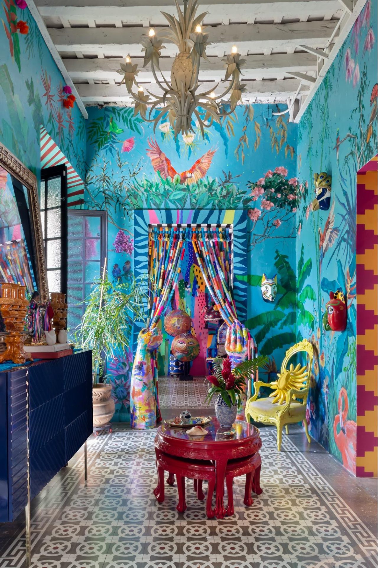
DomaChroma Magazine: What is your favorite color, and why?
Erick Millán: Yellow, without a doubt.
I’ve always been drawn to it. I’m a fan of bananas, mangoes, sunflowers, SpongeBob SquarePants, and just about anything yellow.
Over the years, the color has quietly taken over my life. I own yellow socks, yellow shoes, yellow underwear – you name it.
But beyond all of that, yellow simply makes me happy. It reminds me of sunlight, warmth, optimism, and the energy of a new day. It’s a color that instantly lifts my mood.
I also feel a special connection to it because my second name, Solem, is associated with the sun. Whether that connection is symbolic or not, I’ve always felt naturally drawn to light, and yellow feels like its most joyful expression.
If I had to choose one color that feels most like me, it would definitely be yellow.
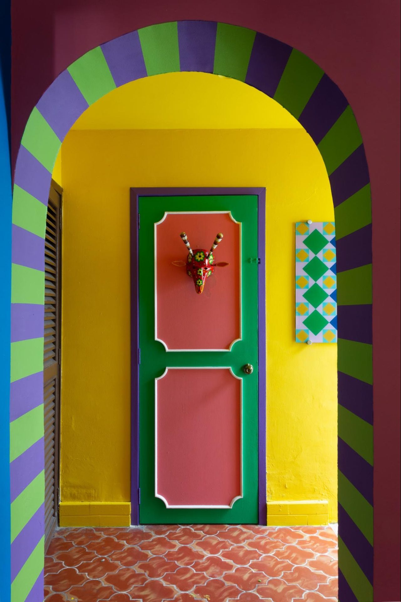
DC: You’re a true believer in color maximalism. When did color and pattern become non-negotiable in the way you design?
EM: To be honest, when I started designing, I wasn’t paying much attention to trends. I was more interested in understanding how to be honest with myself. How could I express myself more freely? How could I give shape to all the energy I felt inside?
My first architecture professor was Japanese, and I’ll never forget something he told me. He looked at me and said, “You need to control that energy. It’s too much.”
At first, I thought there was something wrong with me. But over time, I realized that my job wasn’t to suppress that energy – it was to work with it.
The moment I stopped trying to fit in and started embracing what made me different, everything changed. What some people saw as “too much” became my greatest creative asset.
So when people describe my work as colorful, layered, expressive, or even maximalist, I take it as a compliment. Those qualities come from a very genuine place.
Yes, I’m too much. But this is the only life I have, and I’d rather live it fully than spend it trying to become less of myself.
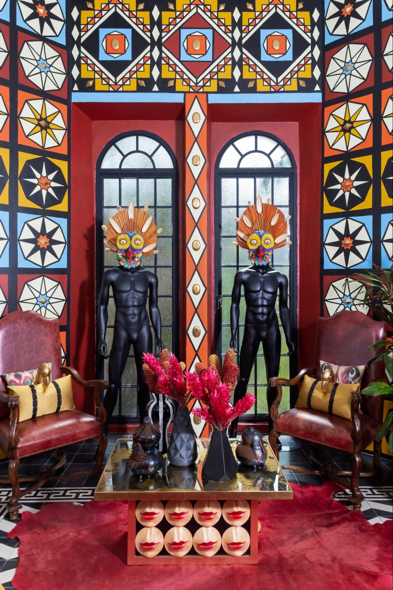
DC: Cobalt blue runs through your work. What does cobalt do for a space that no other color can?
EM: It’s a color I return to often because it reflects the kind of transformation I try to create through design. There is something deeply calming about it, yet it also carries a sense of wonder and possibility.
In a space, cobalt blue can create a feeling of openness while simultaneously making a room feel grounded. It has the rare ability to evoke both sanctuary and elegance. For me, it often feels like stepping into a temple – a place where the outside world quiets down and you become more present.
I also love the sense of visual order it brings. No matter how layered or colorful a space may be, cobalt blue has a way of anchoring everything around it.
Perhaps that’s why I’m so drawn to it. It feels timeless, mysterious, and endlessly inspiring. A color that invites both contemplation and imagination.
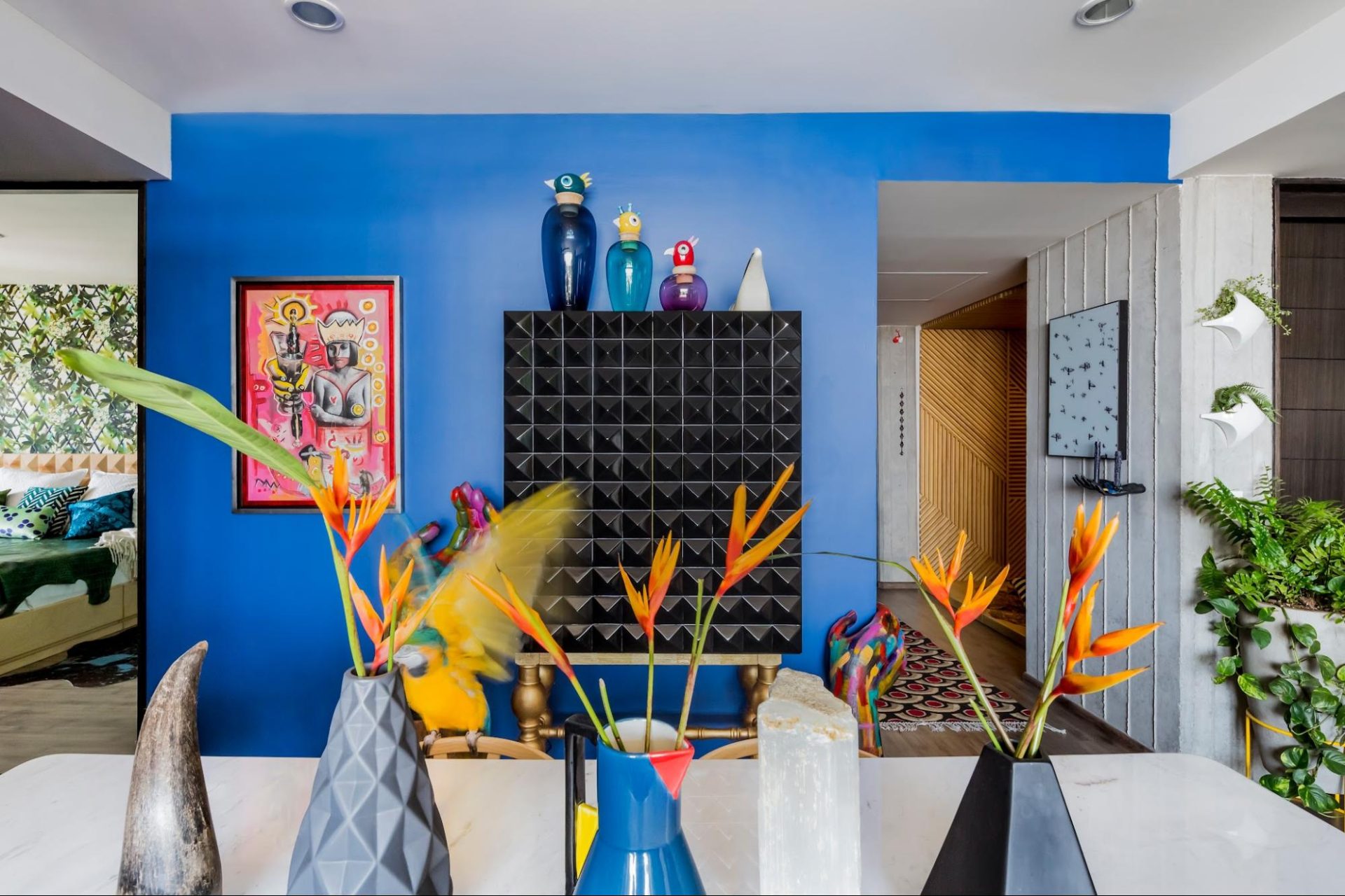
DC: How do Mexican color traditions and craft shape the way you work?
My first museum wasn’t a museum at all—it was the market.
Ever since I was five years old, I would go with my mother to Mexican markets. To be honest, some parts were quite traumatic for a child. I remember seeing hanging chickens, pigs, and other things that felt overwhelming at the time. But looking back, those visits shaped me in ways I could never have imagined.
Mexican markets are extraordinary visual environments. They are not designed according to rules of composition, color theory, or rational order. They are driven by instinct, necessity, and the desire to attract attention. Everything coexists at once: colors, textures, sounds, objects, handmade signs, fruits, flowers, plastic bags, ceramics, and people.
What fascinated me then, and still fascinates me today, is that sense of freedom. Nothing is overly curated, yet somehow everything feels alive.
Today, markets remain one of my greatest sources of inspiration. I visit them with a more trained eye, studying color relationships, textures, materials, and unexpected compositions. Even the most ordinary objects can spark an idea.
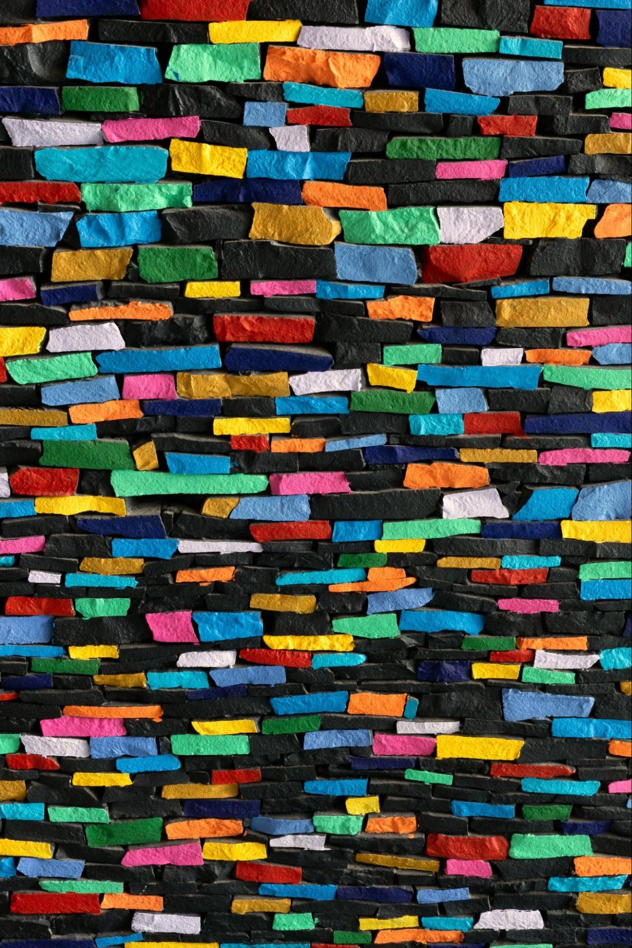
In fact, the texture of the woven shopping bags commonly used in Mexican markets inspired a mosaic design in one of my recent projects, which you’ll be seeing very soon.
I think Mexican craft and color traditions have taught me to trust intuition, embrace abundance, and find beauty in places where others might not think to look.
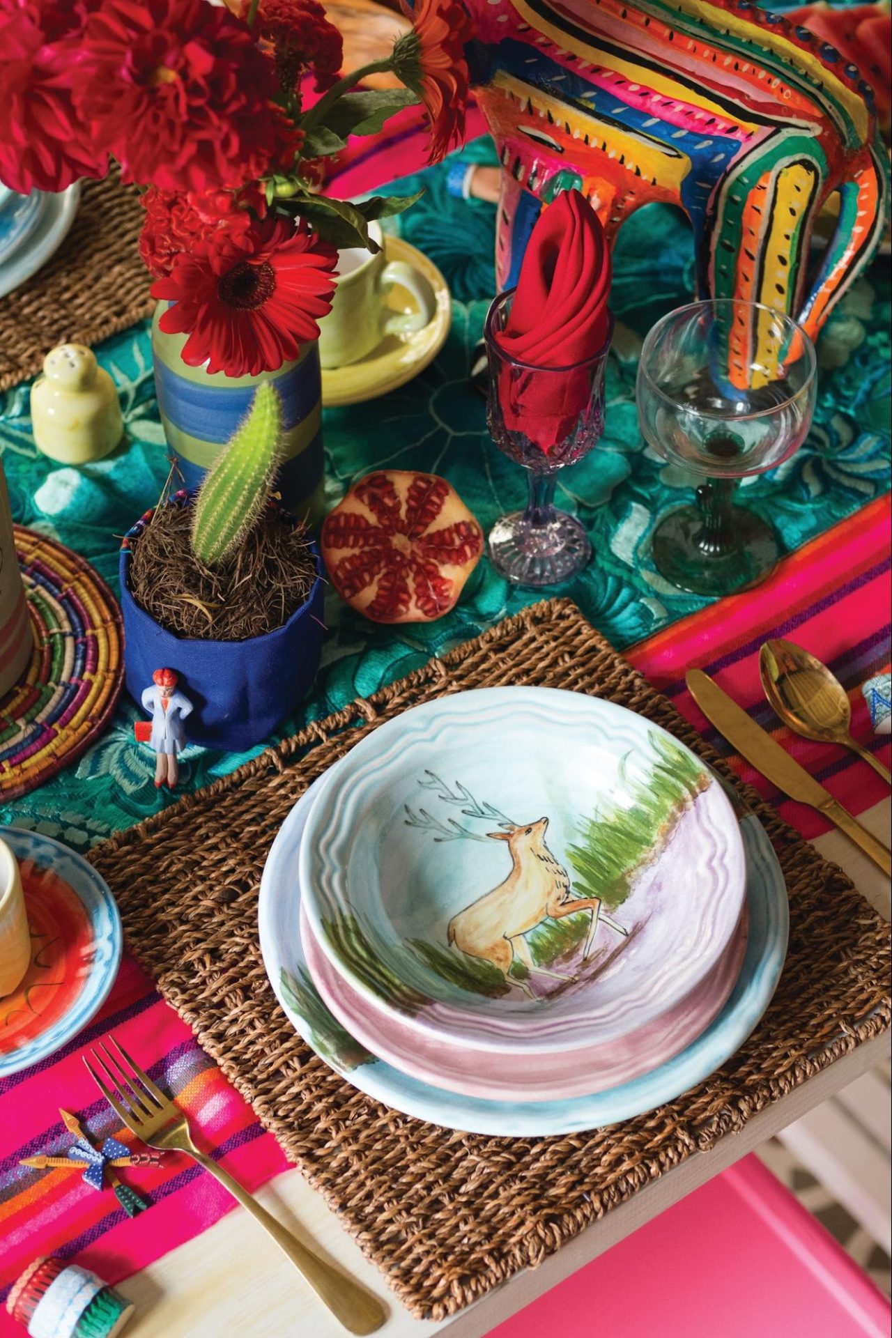
DC: How do you layer pattern on pattern, black-and-white graphics against saturated color, without a room losing its harmony?
EM: To be honest, I’m not entirely sure. Sometimes I feel like I’m becoming a chef of color.
I like to explore, test, experiment, and take risks. Not everything works, of course, but over time it has become more natural for me to combine colors and patterns in ways that feel instinctive rather than calculated.
What’s interesting is that I’m rarely asking myself, “Does this work?” Instead, I’m asking, “How can this space feel more alive?”
I think harmony is often misunderstood. People assume it comes from restraint, but I believe it comes from confidence. A room starts to lose its harmony when fear enters the process, when you begin doubting every decision, second-guessing your instincts, and trying to make everything behave.
Some of my favorite spaces are full of tension, contrast, and unexpected combinations, yet they still feel balanced because there is conviction behind them.
For me, layering pattern and color is less about following rules and more about trusting intuition. When the energy feels right, the room usually finds its own harmony.
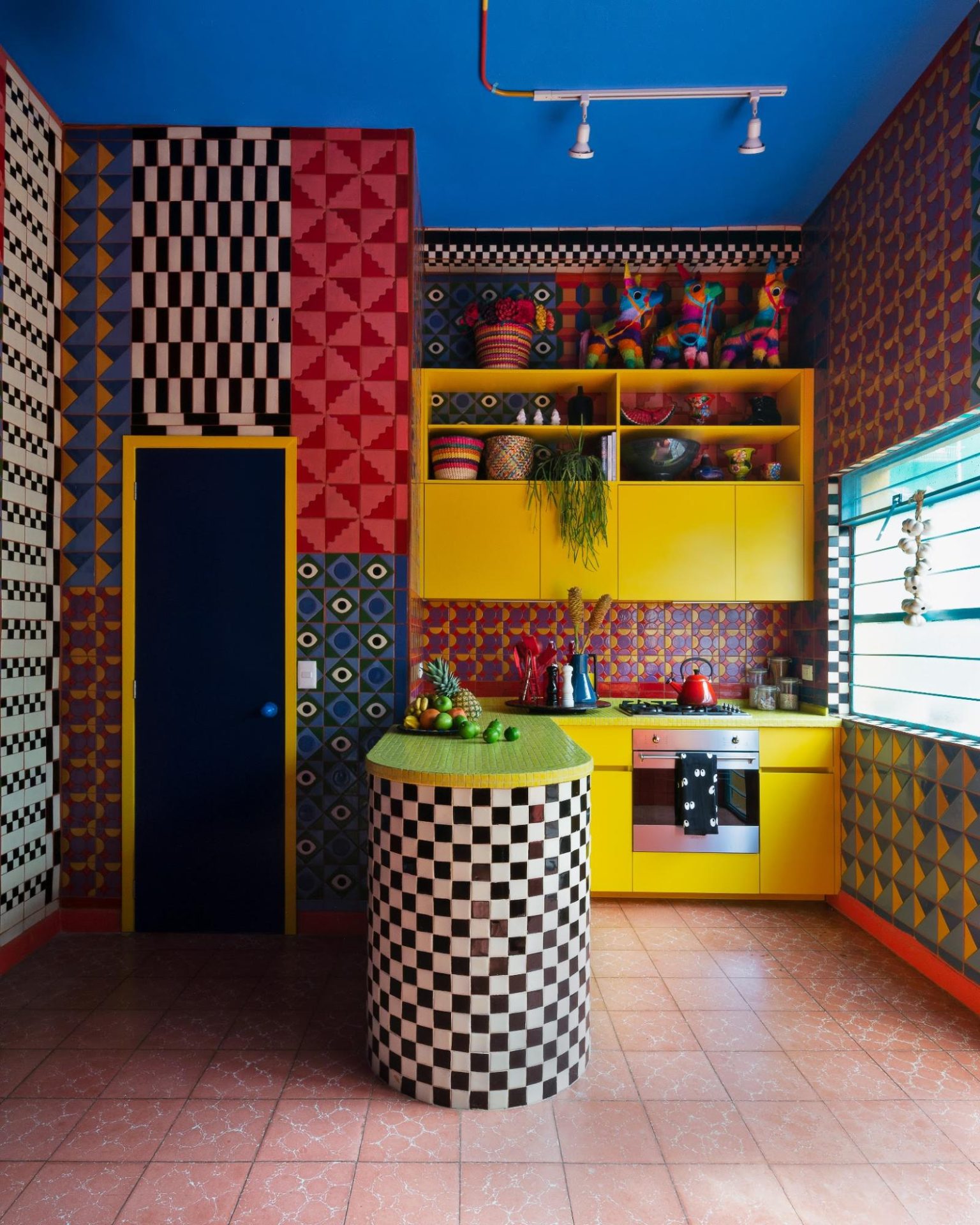
DC: What color move do you wish more people were brave enough to make in their own homes?
EM: All of them.
I wish more people felt free to take risks with color and to let each room develop its own personality. Too often, we feel pressure to make an entire home look perfectly consistent, but life isn’t like that—and neither are the most memorable spaces.
I love homes where every room tells a slightly different story. A dining room can feel dramatic, a bedroom can feel calming, a kitchen can feel joyful, and a library can feel mysterious.
Color is one of the most powerful ways to create those emotional shifts.
I think people are often afraid of making a mistake, but a home should be a place for exploration, not perfection. The spaces I remember most are the ones that have character, individuality, and a point of view.
So if there’s one color move I’d encourage people to make, it’s to be a little braver and allow each room to have its own soul.
DC: What is the story at the heart of your new launch, House of Color?
EM: The House of Color was born from a realization.
Over the years, my work as a designer became increasingly intertwined with my personal life. My main platform evolved into a place where I shared not only interiors and furniture, but also travel, fashion, creativity, hosting, dancing, and the everyday moments that inspire me.
I loved that evolution because it allowed me to connect with people in a more human way. But at the same time, I began to feel the need for a dedicated space where my design projects, objects, collaborations, and creative experiments could live together under one roof.
That became The House of Color.
More than a brand, it is a home for ideas. A place where interiors, furniture, craft, objects, and collaborations can coexist through a shared language: color.
Color has always been the thread connecting everything I do. It is how I understand beauty, emotion, memory, and identity. Through The House of Color, I wanted to create a platform that celebrates not only finished projects, but also the creative process, the artisans, artists, and makers who help bring those ideas to life.
In many ways, it feels less like a launch and more like giving a name to something that has been growing organically for years.
Site: erickmillan.com
Instagram: @erickmillandesign
TikTok: @erickmillandesign