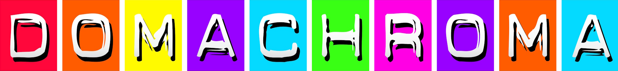
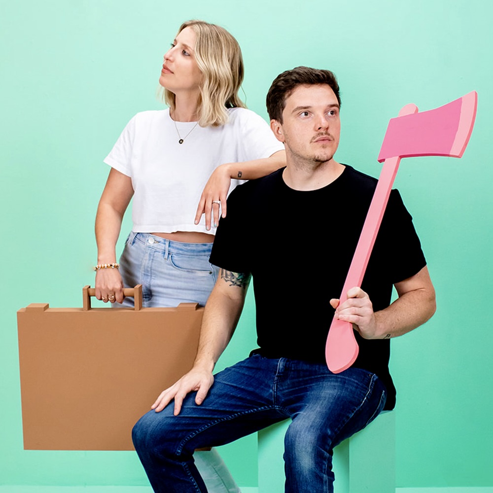
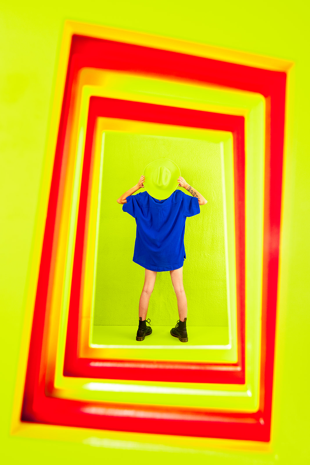
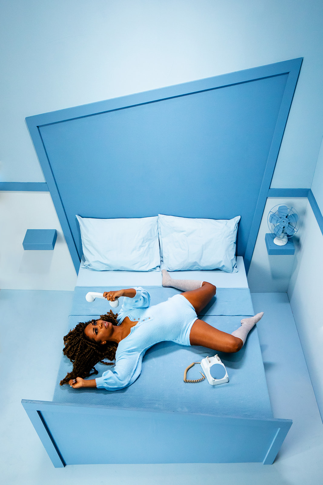
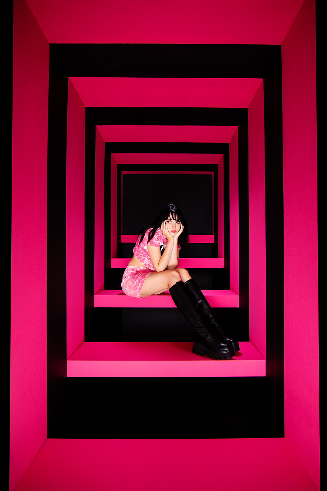
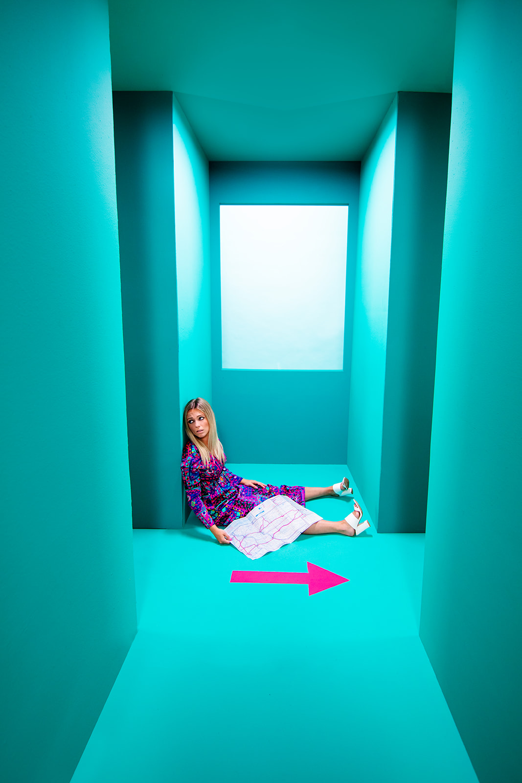
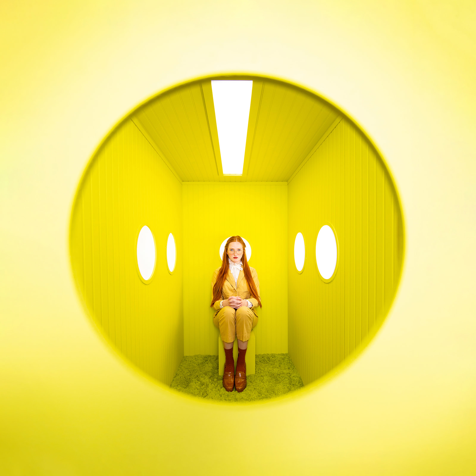
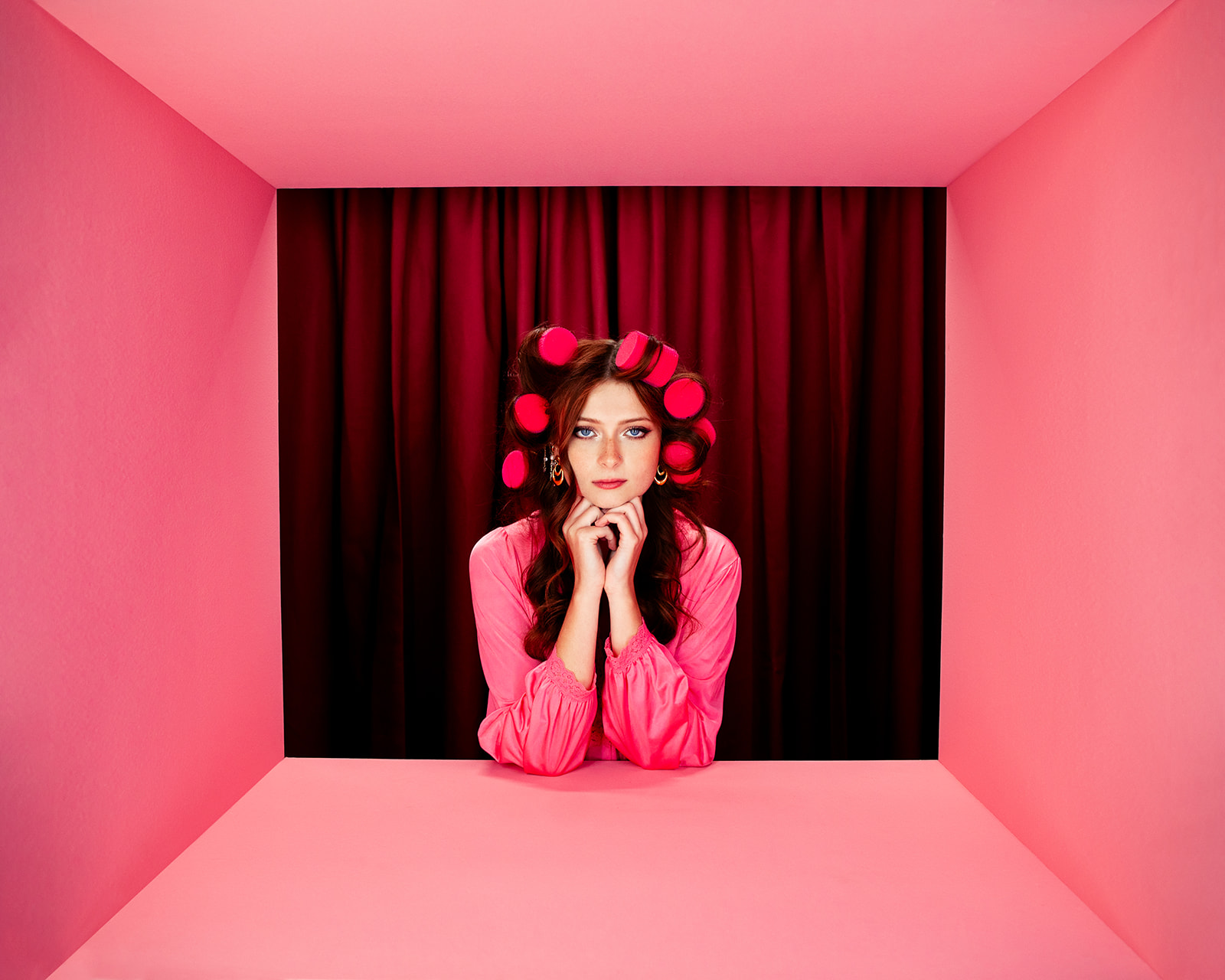
Jada and David Parrish are photographers and set designers for anyone who wants their images to feel colorful, original, and BOLD. Actual rooms. Candy colors. Plywood walls. Forced perspective. After years as wedding photographers, white was never going to be enough for them. The 100 Set Project changed everything: 100 sets, 100 shoots, one year. The result? A color maximalist’s style language that’s loud, surreal, and hyper-saturated. Color like a movie soundtrack. I want a set built by Jada and David in full blown neon rainbow! Follow them at @jadaanddavid and jadaanddavid.com, and imagine the fantastical possibilities for your own work!
DC: What are your favorite colors, and why?
JP: It’s hard for me to pick a favorite!! I’m really drawn to citrus tones like coral and chartreuse. If a color looks like candy or something I’d eat, I’m probably into it.
I also love deep jewel tones like dark greens, burgundy, and cobalt blues. I think I’m drawn to colors that feel bold, rich, and a little emotional. Color completely changes the mood of an image, so I’m always thinking about how palettes make people feel, not only how they look.
DC: During the 100 Set Project, which color combinations kept you going back to the studio?
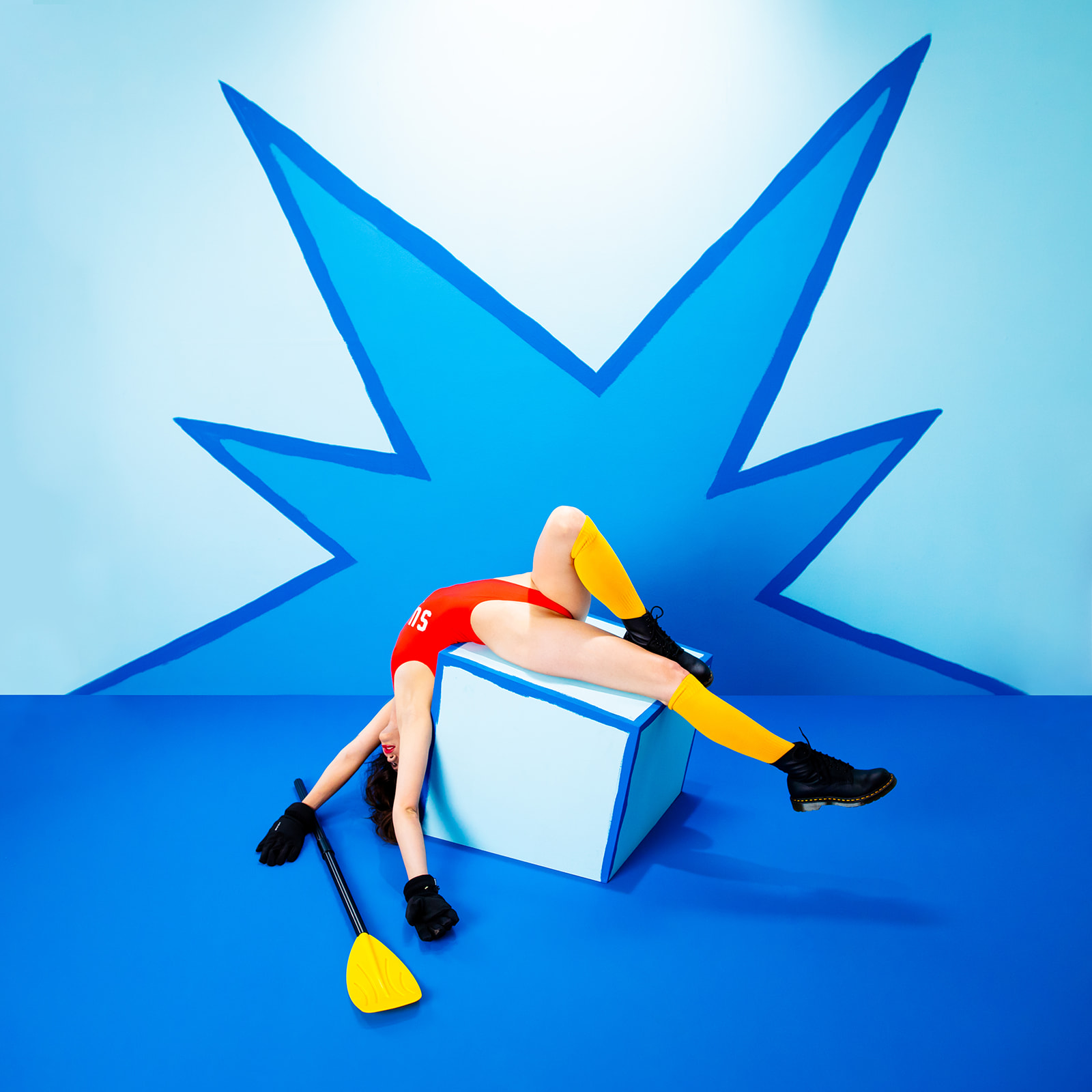
JP: The whole project really pushed us to stop playing it safe with color and start experimenting more.
We learned a lot about color theory through the actual process of making the work. I love playing with both analogous and complementary color schemes. We used combinations like purple and red or teal with burnt orange a lot throughout the project.
We also went crazy with monochromatic color schemes where we used all different shades of a single color. I love how simple and stylized it made the photos look. Sometimes limiting the palette actually makes the whole image stronger.
DC: How does color help you build tension, chaos, softness, or swagger before a single image or video is taken?
JP: To me, color is kind of like the soundtrack of an image. Like in a movie when the music suddenly starts feeling darker or more intense before anything even happens. You already feel the emotion coming. Color does that same thing visually.
We use color to either support the emotion in a photo or completely contrast it. I love using a super happy color like yellow all over a set, then posing the model to look really defeated or emotionally drained. That kind of contrast always gets me. It makes the image feel a little more uncomfortable and interesting.
And if we want something to feel chaotic or really high energy, we’ll lean heavily into colors like orange and add things like stripes or repeating shapes to create more tension in the frame.
I think people naturally attach certain feelings to certain colors without even realizing it, so we spend a lot of time thinking about the emotion first. Then we decide if we want the colors to support that feeling . . . or completely contradict it.
DC: When creating a set, what rules make your creations physically immersive instead of decorative?
JP: All of the sets we build are designed for the subject to interact with them. Everything is structurally sound so our models can actually press on the walls, lean on things, sit on them, and really put their weight into the set.
I think having the models actually engage with the environment creates way more natural emotion within the image. The set becomes part of the photo instead of something sitting in the background, and the reactions and body language feel a lot more real.
We also use a lot of forced perspective and optical illusions within our sets, which makes them feel way larger and more immersive on camera than they actually are in real life. We’re always thinking about how the camera sees the space while we’re building it.
DC: After years in wedding photography, your current color choices are louder and riskier. Which artists, films, or album covers gave you permission to push saturation to the edge?
JP: I think we were honestly just so sick of white. With weddings everything was super bright, airy, and desaturated all the time, and we were craving color.
David and I are both 90s kids, and I think a lot of our color choices come from the things we loved growing up. Cartoons were a huge influence on us visually. I think at some point we stopped trying to make our work feel “grown up” and started letting our inner children show up more in the work. A lot of 90s album art, magazine covers, and music videos really shaped us too. That era was so bold and stylized, and honestly I feel like our brains are still living there a little bit.
Photographers like David LaChapelle and Rankin were also huge inspirations for us. Their work reminded us that images can be loud, surreal, weird, hyper saturated, and emotionally charged all at once. Seeing artists push things that far creatively gave us permission to stop holding back and really go for it.
And one movie that really impacted our color choices was “But I’m a Cheerleader.” The set design and color work is another level.
DC: Your work balances photography, motion, lighting, and sculpture. How do you keep the creative process cohesive when so many visual elements are competing for attention?
JP: Everything always goes back to one question for us: does this support the original concept? Once we have the idea, every decision about color, lighting, styling, motion, and set design has to support that feeling or story in some way.
David and I naturally split up different parts of the creative process based on what each of us gravitates toward. We usually come up with the concepts together. David leads a lot of the set design and building. I handle a lot of the color choices and styling for the looks.
David also handles the lighting, while I direct the shoot and work more with the emotion, posing, and movement of the subject. Then afterward, he does the retouching and I handle the color edits.
Even though we each have our own roles, the whole process is really collaborative. We’re constantly bouncing ideas back and forth and refining things together at every stage.
DC: What is your message to creators and photographers?
I think our biggest message to creators and photographers is to make work that actually feels true to you. Especially if it’s weird, specific, or doesn’t totally make sense to other people yet. The goal shouldn’t be fitting in. Your work is supposed to feel different because you are different.
I think self doubt stops so many creatives from making and sharing their work. But honestly, I usually take that feeling as a sign that I’m making something meaningful or personal. If the idea scares you a little, you’re probably onto something.
And you have to be willing to make bad art. That’s part of the process. You have to make things that fail, things that feel awkward, and things that don’t fully work in order to eventually create something great. Every artist you admire made a lot of work that nobody saw before they made the work they became known for.