Rosemary, what is your favorite color and why?
My favorite color is red. Maybe it’s because every time I wear red someone says “You look so great in red.” But, more importantly, red seems vibrant and powerful to me. Red is a burst of energy. Red is happy.

Can you share your earliest memory of being drawn to bright, bold colors?
As a kid I was mesmerized by all the blues of the ocean, the bright sunny colors of canary yellow and mandarin orange and the playful colors of bubblegum pink and kiwi green. Pappagallos were vibrant leather ballerina flats with a floppy flower on the front that came in all the colors of the rainbow. I loved those shoes. I coveted the apple green ones I wore to the Junior prom with an empire waist dress I made from a Simplicity pattern. I grew up in the 60’s and 70’s when pop art was exploding with artists like Warhol, Lichtenstein and Rothko. Twiggy wore thick black eyeliner, blue eyeshadow and pink lipstick. We stuck giant crayon colored daisies on our VW bug. I chose primary colored Marimekko place settings for my first home.
It is interesting that most people would claim to have a favorite color and that color is rarely beige or brown or gray. I think bold color grabs the viewer’s attention and often elicits a very personal emotional response. People crave color and yet are often afraid to use it in their homes or attire.
How do colors influence the emotions and perceptions of your audience?
A bold color palette can be challenging because it says “look at me,” “I’m here,” “I’m brave and alive.”
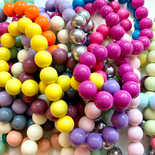
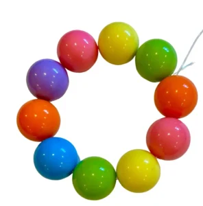
I think that may be why shoppers love my necklaces and bracelets. It is not often that they are presented with such a vibrant array. The beads provide an opportunity to display a splash of color, to offer an unexpected pop of energy and verve to an otherwise mono-toned world.

Have you faced any challenges in working with such a bold palette?
Typically I look to the colors of nature and the vibe of the season to make my necklaces. Many are solid, bold colors, others are combinations of colors that reflect the vibrancy of nature or the energy of the season. I’m always interested in the Pantone color of the year and I take that into consideration. I also provide shoppers with an opportunity to design their own piece, choosing the colors that excite them.

Do you have a favorite project that showcases your use of bright, bold colors?
Working with color is a visceral experience that requires getting in touch with the feelings evoked by color, emotionally or physically. Color work is based on gut feeling and instinct. It is not overly rational or intellectual. For me, it’s exciting to embrace the joy and expressiveness of color and to share it with the world.