Once, colour was chaos.
Designers would point at a blue and say, “a little lighter . . . no, not that light . . . maybe like the sky but after rain.” Printers would squint, adjust ink, and pray that what came out matched what was in the designer’s mind. Somewhere between imagination and production, the truth of colour got lost.

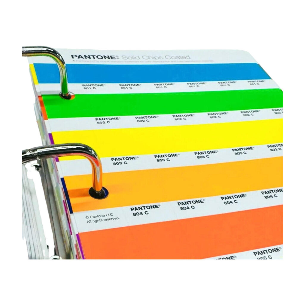
Then came Pantone . . . a quiet revolution disguised as a small book of swatches. Pantone did not invent colour. It gave colour a common language. Each shade was given a name and a number like an identity card for colour itself.

So when you say Pantone 485 C, you are not describing “red.” You are calling on a precise formula . . . how much of which pigments, on which kind of paper, with what finish. That number ensures that whether you are in Tokyo or Toronto, your red will always be the same red. That is the magic.
There is something strangely poetic about this idea . . . that colour, the most emotional and personal of experiences, can be codified. Yet the system works precisely because it respects both the science and the soul of design.
Behind every Pantone shade is chemistry and calibration, inks measured to microscopic levels. But behind every colour choice lies a story: the calm blue of trust in a brand logo, the defiant orange of a protest poster, the tender blush on a magazine cover that feels like spring. Pantone sits quietly in the middle of it all . . . letting emotion meet precision.
The Pantone Matching System (PMS) was born in 1963 when Lawrence Herbert, then a chemist working at a small printing company in New Jersey, realized the printing industry had no standard way to communicate colour. What one printer called “lemon yellow” could look completely different to another. So he catalogued and numbered each hue, creating a universal dictionary of colour.
Decades later, that dictionary still shapes the world we see. Designers keep a Pantone guide on their desks like a sacred text. Fashion brands use it to dye fabrics exactly right. Tech companies use it to match product packaging with digital screens. Even paint manufacturers reference Pantone codes to ensure consistency from sample to wall.
But here is where it gets interesting . . .
Pantone did not stay confined to printing. It evolved into a cultural barometer. Each year, the Pantone Color Institute chooses a “Colour of the Year.” It is not just a trend, it is a reflection of how we collectively feel.

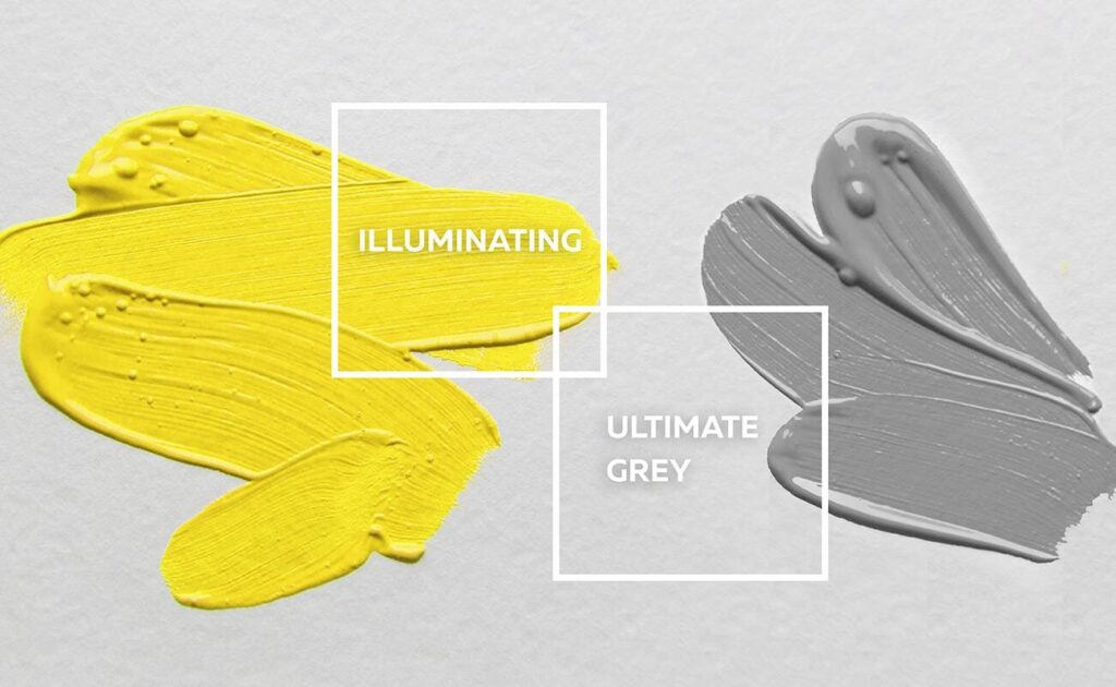
When the world slowed and struggled through the pandemic, Pantone chose two colours for 2021: Illuminating Yellow and Ultimate Gray. Hope and resilience. Light and grounding. It was less a design decision and more a mirror held up to the human mood.

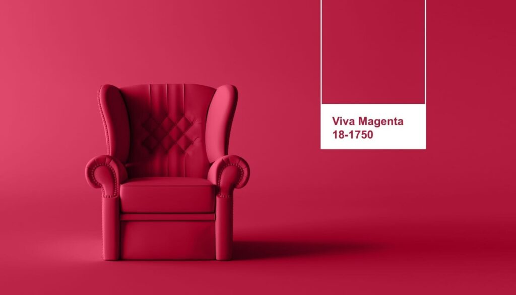
And when 2023 rolled around, Pantone announced Viva Magenta, describing it as a “brave and fearless” shade rooted in nature, drawn from the red of cochineal dye — the strongest natural pigment known. It felt like a pulse. A reminder that vitality, even in uncertainty, still burns bright.
Pantone has become something bigger than a reference system. It is the emotional weather report of design.
When you see a campaign bathed in coral or lavender or emerald, there is often a Pantone swatch behind that decision . . . a quiet handshake between the designer’s intuition and the manufacturer’s precision.
Every designer knows this moment: that strange, tender click when a colour feels right.
Pantone gives that feeling a shared vocabulary . . . so that feeling can travel through screens, presses, fabrics, and walls without distortion.
If you think about it long enough, it is almost philosophical.
Pantone is not just a book of colours, it is an attempt to preserve the fleeting.
To take something subjective, emotional, and deeply human, and hold it steady long enough for others to see it exactly as you imagined.
Maybe that is what all good design tries to do . . . take the mess of emotion and memory and make it visible.
Pantone just happens to do it with colour.
Hriday Checker
waffledesigns12@gmail.com
linkedin.com/company/waffledesigns/
https://topmate.io/hridaychecker

