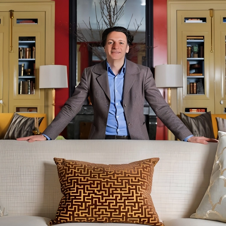
NYC based designer Garrow Kedigian is ChromaDoma for high-gloss jewel tones palettes and sumptuous fabrics. Known for custom furniture—velvet banquettes, sofas with leather welt details—and meticulous architectural millwork. The work of NYC based Garrow Kedigian Interior Design has appeared in House Beautiful, Elle Decor, Veranda, and Architectural Digest.
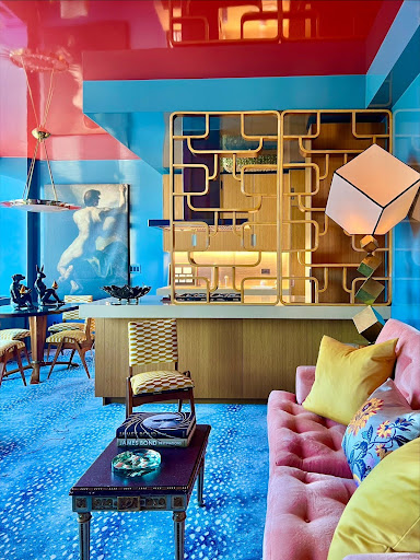
DC: Your use of ruby red and light blue in your work feels both fearless and finely tuned. What inspired this duet—and how do you keep it feeling intentional rather than overwhelming?
GK: I was in Milan for one of the design shows and saw a kitchen that had been done in a ruby red and a pale blue ceiling. I was inspired by the color combination, and have always loved red and blue together. I think any two colors can be paired together as long as you understand which tones of each can best counterbalance one another.
DC: Is lighting a secret ingredient in activating color—and if so, how do you approach it?
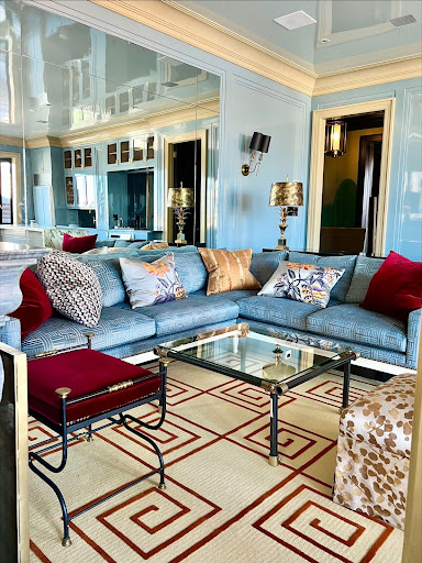
GK: Yes certainly lighting is critical to any space – but contrary to what most people think, even when a space does not have a lot of light, it’s still ok to do saturated colors as long as you calibrate them to have the right tones. For instance, when a room is naturally dark, I always make sure that the tone of saturated color I use has an effervescence about it. Lighter rooms are easier, because they naturally support saturated colors—they feel brighter and more vibrant.
DC: You dial up your paint, cabinetry, and upholstery color choices—how do you decide which version of light blue and red earn a place in your palette?
GK: You have to study your colors on site–if you know the color palette you are aiming for, it is crucial to study different shaped variations on site to determine which one works the best with your orientation and natural light. You can never do too many samples and study it at different times of the day and in different weather conditions before making a final selection. There is no catalog of pre-selected colors. It’s different for every project, and sometimes I find myself mixing paints to achieve the perfect hue.
DC: Mixing jewel tones, metallics, and bold patterns appears effortless in your designs. For someone new to maximalism, what’s your advice on mixing textures and tones without tipping into chaos?
GK: This is a rather difficult question to answer. It seems a little bit intuitive to me, but complex to others. If I had to analyze it, I would say one or two bold gestures are always good in a room, but you always have to put everything together, such as a complete fabric schematic, and study it with your wall colors in order to calibrate it perfectly. I think as a designer you know when it’s just right.
DC: Let’s talk emotion. When you walk into a room, how does the color pairing of ruby red and light blue feel to you—and what do you hope your clients feel?
GK: I always want to achieve a positive energy and an exuberance in color intonation that I use for any room. So I go for cheerful and upbeat on the saturated color scale, making things pleasant and happy.
All photos credited to garrowkedigian.com