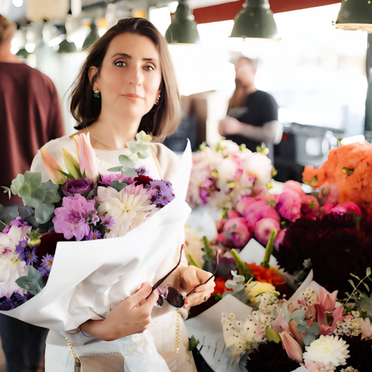
Welcome to the rainbow tie dye silk velvet world of Fig & MossMakery, where color takes center stage in bringing creative vision to life. Artist Pelin Rohde’s work is a dazzling display of vibrant hues and compositions.
Pelin, what is your favorite color and why?
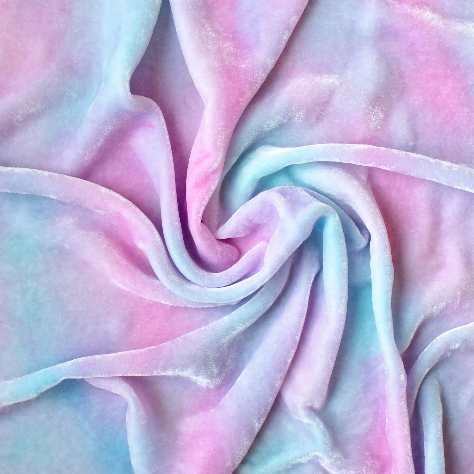
What a great question to kick off this interview, thank you. By the way, as I’m pondering this, I’m staring at the clouds from my window and just noticed a faint rainbow stretched across the sky – which honestly says a lot. It’s never been easy for me to choose just one favorite color. Not only do I love colors but I also love how they interact. Pastel rainbows make me giddy. Powder pink paired with latte brown feels so cozy. And blue and white is just timeless. But if I had to choose, I’d say navy blue. It feels like velvet in color form: it’s rich, it’s trustworthy, yet it’s serene. It’s grounding but not in your usual earth-tone kind of way.
Can you share your earliest memory of being drawn to bright, bold colors?
One of my earliest memories of bold color is from our summer vacations when I was little—being completely taken by the bright red hibiscus and magenta bougainvillea blooming everywhere. I grew up in the Mediterranean, where spring and summer explode with color. There is something about the contrast of vibrant flowers against sun-bleached stone walls and the turquoise sea that has stayed with me. Those colors still inspire my color palettes.
How do colors influence the emotions and perceptions of your audience?
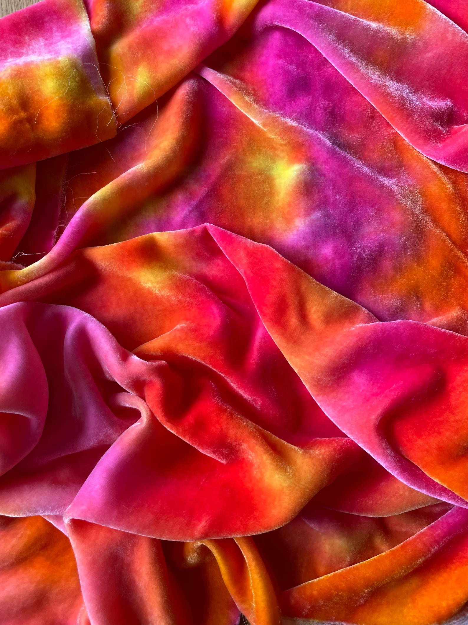
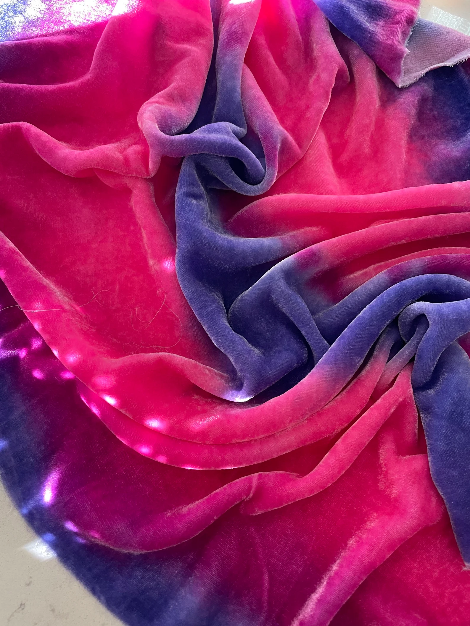
I think the in-betweens are where the emotions are—the transitions, the blends, those spots where colors bleed into each other across the velvet and create something unexpected. That’s where the magic is. My audience often responds most to those surprises; like when a shade shifts slightly and forms a completely new feeling. There’s a reason people are drawn to tie-dye—it’s that element of unpredictability and wonder. At the same time, when I use more structured techniques, like colorblocking, the clean contrast creates a totally different emotional effect. One is playful and free, the other is clean-cut and intentional. I think the contrast between the two keeps things exciting—for me and for the people who connect with my work.

Have you faced any challenges in working with such a bold palette?
Absolutely. Bold colors are beautiful but they have a mind of their own. I have had to re-dye my silk velvet when either the color didn’t turn out as saturated as I intended, or reverse, when it turned out too bright for the design. And sometimes colors bleed farther than I planned out (it’s like they “walk away” from their assigned places), therefore changing the borders I created for the palette. When I’m dyeing velvet, color can surprise you—it shifts depending on the temperature, the length of time the dyes are cured, and the formulas I use. But those “challenges” often lead to the best surprises. I’ve learned to embrace unpredictability as part of the magic.
Can you walk us through your creative process? How do you choose your colors?
I’d love to. I see color combinations everywhere—on a flower, a swimsuit in a store, a children’s dress in a catalog, or even a tropical bird on Pinterest. The world is basically a living mood board. When something catches my eye, I take a photo or a screenshot and save it to my “Color Inspiration” album on my phone. When I’m ready to create I pick a palette that speaks to me, and head to my dye table. That’s when the fun begins. Sometimes my customers suggest palettes too, and their ideas always surprise me in the best way. I’ve got about a hundred dye colors in my studio—and honestly, I haven’t even used them all yet. There’s always more to explore.
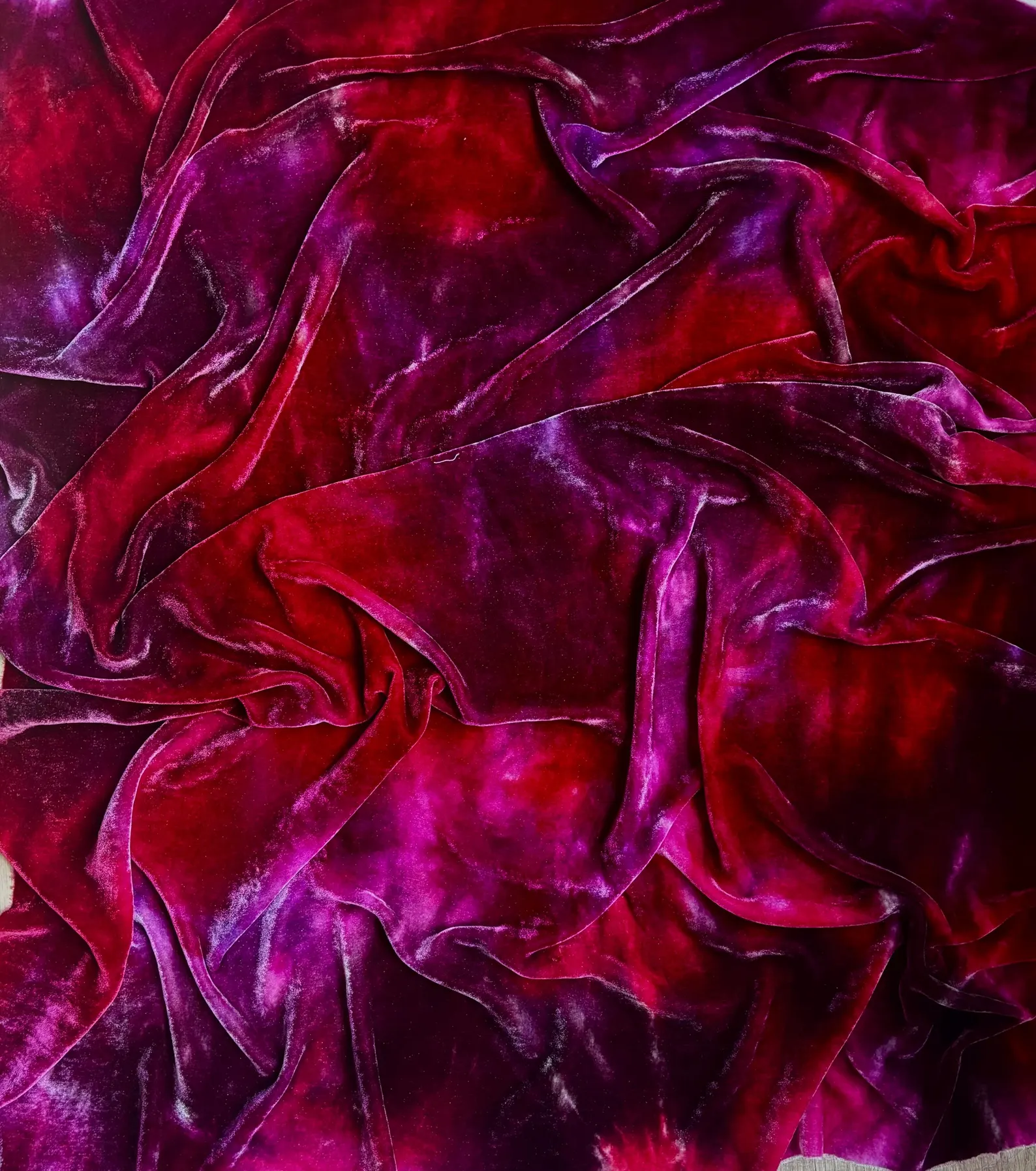
Do you have a favorite project that showcases your use of bright, bold colors?
My bright rainbow on silk velvet has to be my favorite project to date. I absolutely love using hot pink to start off the palette. Then we go into the full rainbow and the fun begins, ending with a rich purple.
What advice would you give to aspiring artists who want to incorporate bold colors into their work?
Don’t be afraid to be loud. Color is a language, and bold colors are just very expressive speakers. But learn to listen, too. Let the colors guide you, experiment wildly, and don’t worry about being “too much.” You’re not making beige cubicle art—you’re making something that will be felt deeply. And most importantly: play. Color loves to be played with.