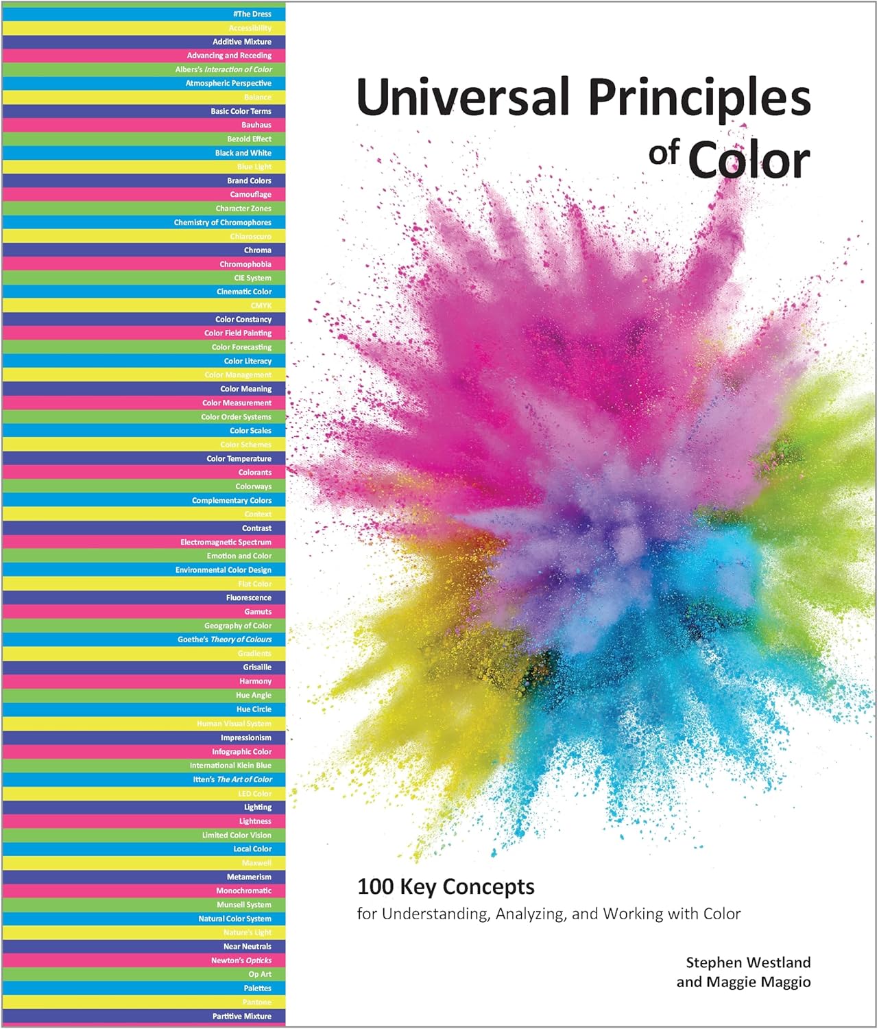
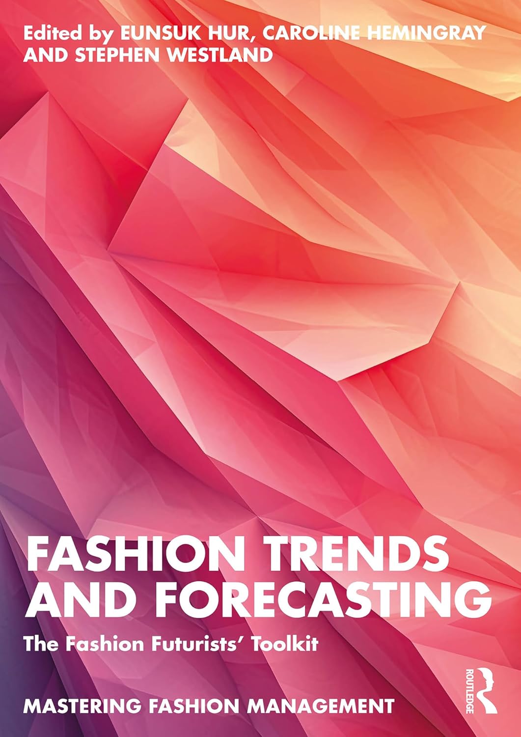
Dr. Stephen Westland is a Professor of Colour Science and Technology at the University of Leeds, England. He is an expert in color perception, color design, and color measurement, with a multidisciplinary approach that combines science, psychology, and art. His research spans how humans perceive color, how it affects emotions and behavior, and how it can be applied in industries such as design, fashion, and technology. Professor Westland has published extensively on color science and has worked with various industries to optimize the use of color for psychological impact and product appeal.
Dr. Stephen Westland’s Blog, Colourchat
Why are bright and bold colors so powerful in uplifting mood and energizing spaces?
This is a really interesting question. I think it has to do with associations. We associate bright and chromatic colours with positive things and positive emotions. Many people feel uplifted on a sunny day rather than a grey rainy day. And that may have been especially true of our ancestors who lived outside more. There is something called The Hunt Effect which is where objects appear more colourful on a bright day when the intensity of the light source is high. So, it is easy to see that we might associate bright and colourful colours with positive emotions and some of this might be hard-wired in us now. That said, I think there may be cultural aspects to this as well. That is, colours such as yellow and red are associated with happiness and joy and this is reinforced culturally by things that we see and experience throughout our lives.
How do vibrant colors positively influence our emotions, creativity, and sense of well-being?
The first thing I would say is that we know a bit less about this than one might imagine after 100+ years of research into colour. Many studies have been carried out and reported, but sometimes the studies could have been carried out in a better way and we can always be sure of the reliability of the findings. This is compounded by the difficulty in quantifying things such as creativity and even wellbeing. I have seen some studies that suggest that purple is good for creativity but I am not totally convinced. I would really like to carry out a study on the effect of interior design colour, for example, on creativity.
It is often stated that red has this effect and blue has that effect, for example. But these effects that we are talking about are psychological, and therefore we might expect them to vary between individuals. For example, take the idea of colour preference. Not our preference for the colour of our car or clothes, for example, but just general abstract colour preference.
When asked which colours people prefer in a general sense, overwhelmingly people prefer blue. People like blue and they don’t like yellow. Many studies have confirmed this over a century and with different populations (cultural groups). However, some people don’t like blue. Some people like yellow. One idea for why people have colour preferences at all – in this abstract sense – is that we like colours that we associate with things that we like. Blue might remind us of the sea or of blue sky on a sunny day for example. And because we live in the same world, there is some consistency or pattern in these colour preferences; as I said, on the whole, people like blue.
But if this idea of associations is true then one can imagine that small differences, for example, in our childhoods, could result in some individualisation of these associations. The point about this is that someone who likes blue might feel better in a blue-decorated room, whereas someone who doesn’t like blue might feel more uncomfortable. Therefore, another reason it has been difficult to study the effect of colour on, say, wellbeing, may well be that there are individual variations. To understand these variations we might need to carry out experiments on large populations; this is expensive and difficult. So there is quite a lot we still don’t know.
Are there particular colors or combinations you find especially effective for sparking joy, focus, or optimism?
For me, it’s very simple. When I see bright yellow, red, or orange, it just makes me smile. I am one of those people who don’t like blue.
In your research, how have you seen bold color transform environments—whether in homes, public spaces, or even product design?
As mentioned, it is difficult to do this research well. In an ideal world we would want to control everything apart from, say, the colour of the walls in a room. But if you imagine a research project we would want to paint the walls red and then evaluate how people feel in that space and then a few weeks later we would like to paint them blue and do the same thing. And then a few weeks later we would paint the walls yellow and do the evaluations again.
The problem is that such an experiment could take many months. When it started, we might be in winter with dark afternoons, and by the time we finished, it we could be in spring. And that might affect the outcomes; it might affect how people feel. So at the beginning of the experiment we are evaluating how people respond to blue in the winter, and then later we are evaluating how people respond to yellow in the spring! This is not a good experiment. Ideally, we want to randomise the order in which people experience the different colours (so that some people experience blue first and others experience yellow first, for example) but this involves changing the room colour on an hourly basis!
This is why I currently have a PhD student who is exploring the effect of interior design colour on how people feel but she is doing it using virtual reality. In a virtual space we can easily change the room wall colour and we can conduct a properly randomised experiment. This is ongoing research that we are conducting now and I hope we will have some interesting results in a few months. We have previously published research that shows that the results that we find in a virtual environment are applicable to the real physical world.
I would simply direct you to the excellent TED talk about the joy of colour by Ingrid Fetell Lee which you can see here


