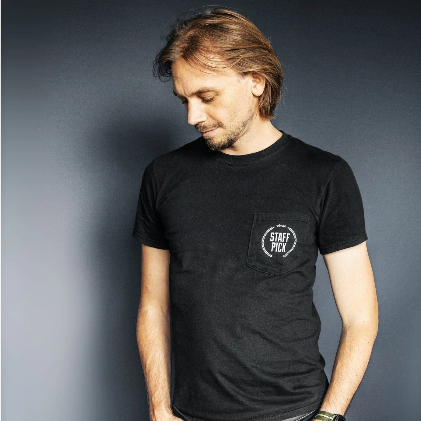
Last month, I wrote an article championing the work of Julius Horsthuis – a peak into the future of art for the masses. I am so grateful that he agreed to an interview with DomaChroma Magazine.
An Amsterdam-born digital artist, Horsthuis is perhaps the most well known fractal artist in the world. He turns algorithms into world building, creating vast cinematic fractal worlds that have lit up Atelier des Lumières, ARTECHOUSE, and global music stages with collaborators like Lady Gaga, Avicii, ODESZA, and Guillermo del Toro. A master of the immersive “infinite,” he invites us to endlessly fall into color, geometry, and wonder.
DC: What is your favorite color?
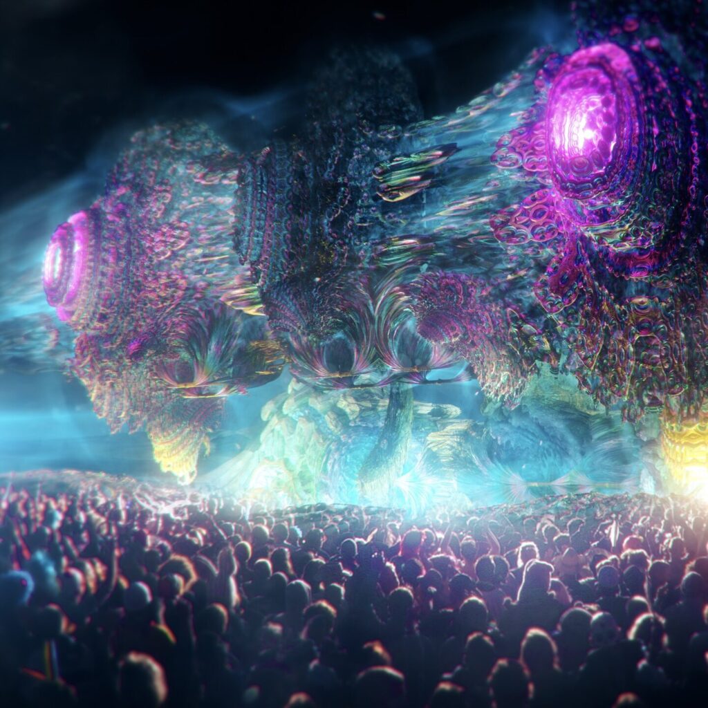
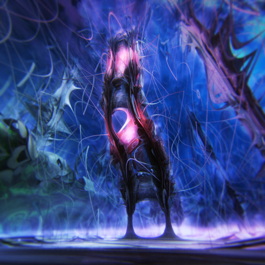
JH: I usually don’t really think in terms of favorite colors, but I’ve been told my Instagram page betrays a lot of blues in my work. That would mean that I tend to gravitate towards deep blues, but I do contrast that with other colors as well, and always experimenting with colors.
DC: How do you work the balance between design, music, and color palette?
JH: I think this is a very intuitive practice. I don’t think I’ve ever given much thought on how exactly I intuit the interplay between colors and music, although I’m sure I have very strong tendencies toward some connection between the two. But this feels deeply instinctive.
DC: What role does color play in your art?
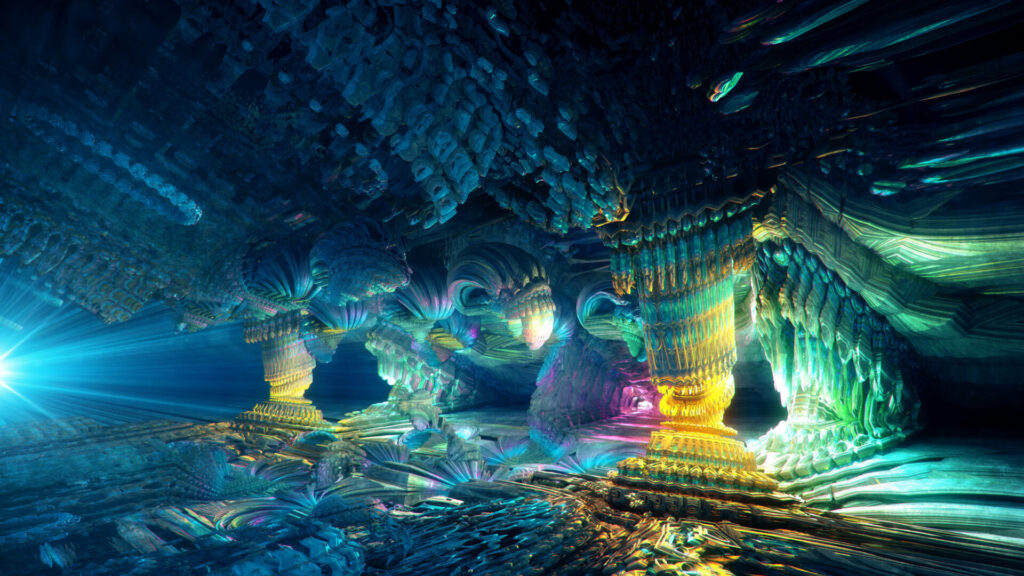
JH: Fractal art is very abstract and since it contains no inherent color, it quickly can become a colorful mess. Using colors correctly can have the effect of grounding it to something more recognizable, or something that ‘feels’ relatable, even though it really isn’t, due to the abstract nature. So colors are very important for me. They put the mathematics in a human framework.
DC: Let’s talk about the future of digital art within immersive experiences. What changes do you expect in the next 10 years?
JH: I’m not thinking about the future a lot since it’s so utterly unpredictable. One technological innovation I love is that high-quality screens become better and more available. My hope is that bright, HDR, and high resolution immersive displays (like LED domes) will become more commonplace as I would love to create for them.
DC: Does your relationship with color change as the mediums for digital art expand and grow, from screen, to fully immersive, to mediums like The Sphere?
JH: I think with larger screens and more immersive spaces, I’d like to experiment with more realism in colors – getting photorealistic colors in abstract visuals is still a challenge. I would like to experiment more with that.
DC: Is there a tool that you use to help develop your color choices?
JH: I’ve used the Magic Bullet Looks Suite for a long time and I still love it. I started using a lot of the presets in order to develop a look and use them as a jump-off point, but gradually I’ve stopped using the presets and just use the color tools by themselves.
DC: What color advice do you have for designers and creators working with Mandelbulb 3D?
JH: With software like Mandelbulb3D, it’s very tempting to overuse, overexpose, or oversaturate. My advice would be to always use muted colors and to use post-processing (grading) to get the look that you’re after.
DC: Where do your own personal color instincts come from?
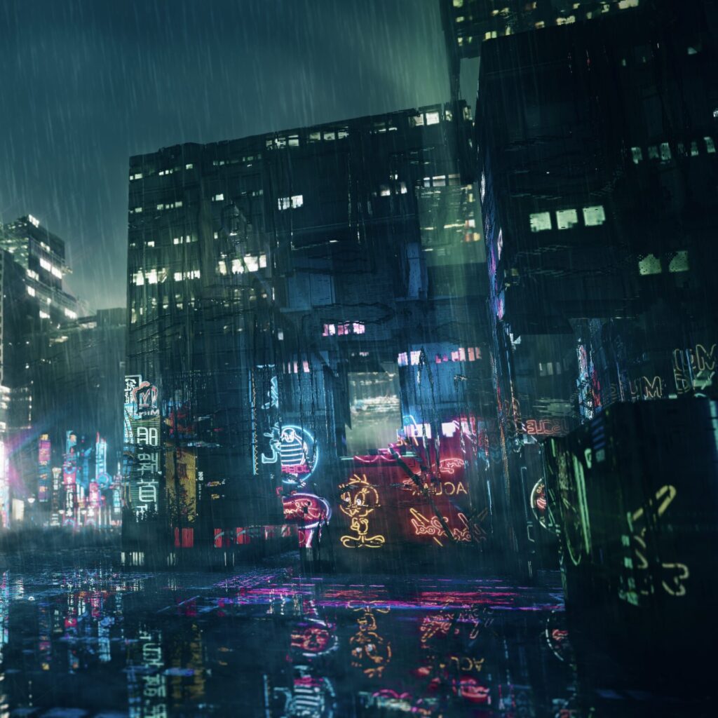
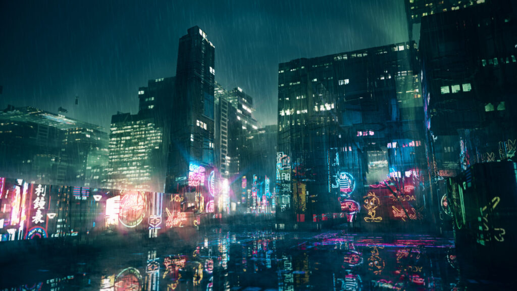
JH: Probably from watching a lot of films. Already as a kid I watched a lot of movies, and I think a certain distinctive grading look that I’ve seen in films ranging from Terminator 2 to Prometheus (both very blue!) would have informed my color instincts.

